How to Create a Department Listing or Directory Page (Part 2)
The most important information when showcasing a department or directory is a mission statement, leadership biography, and pertinent contact information. Here's how to design a website that makes those details look as important as they are to your organization.

In our previous post, How to Create a Department Listing or Directory Page (Part 1), we talked about the importance of having a well-designed directory listing and showed you how to build one.
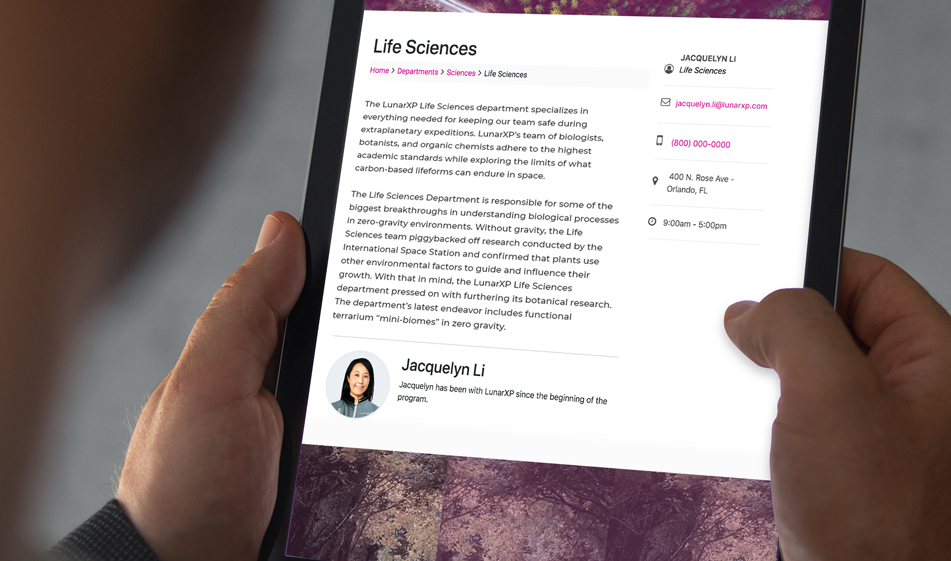
In Part 2 we will talk about how to design and build a single department page. Remember, getting people to find the directory link they're looking for is solving half of the problem. They also need to be able to find the information they need once they land on that page. On this department or directory page, we'll have three sections: The mission statement, leadership, and contact information.
1) Mission Statement
Your mission statement should talk about your philosophy, what is important to your organization, your vision, and goals. It doesn't have to be very long; a couple of paragraphs is enough. It should speak to the main reasons why your audience would trust you and get to the heart of why your business exists in the first place.
2) Leadership Information
Displaying a department's leadership through images and a short biography will bring life to your website and help develop a connection with the site visitors. Pick a photo that best portrays your leadership and keep the bio short, between 100-150 words. A short bio that summarizes accomplishments, experience, and values will be much more interesting than a long boring one. It will also prompt more people to read or skim through it.
3) Contact Information
This is perhaps the most important section on a directory page. Don't bury the contact information under other content. Put it in a prominent place so that visitors can find it easily. The sidebar is an excellent place to put the contact information. Below, we'll show you how to do that.
As in Part 1, we use Bootstrap for the layout and FontAwesome for the contact information icons. If you haven't done so, add the following external links to your HTML file:
HTML
The HTML code below includes breadcrumbs to show the users which page they're on (if you'd like to know how to make breadcrumbs, we have a tutorial for that here), a main section that includes a div container that has the mission statement and another div container that has the biography. The sidebar uses an aside tag for the contact information. All the containers and the sidebar has the necessary Bootstrap column grid sizes to scale nicely in different browser sizes.
CSS
Since the most of the layout work was done by Bootstrap's grid system, below CSS code only has the adjustments for the margins, padding, border, and font-sizes:
Want to see how it all looks before committing to its use? Check out the JSFiddle below. Be sure to scale your browser windows to various sizes to see how these sections would look on mobile display.
Paris Tuzun
Contributions Editor here at Solodev. Want to be featured on the Solodev Blog? Get in touch.
Follow me on Twitter