 Cloud
Cloud
 CMS
CMS
 AI
AI
 Blockchain
 Digital
 IoT
IoT
 Metaverse
 Mobile
Using Bootstrap Card Columns to Dynamically Expand Your Content
Need to add content across multiple columns? With Bootstrap, you can dynamically fit your content to whatever dimensions you specify without breaking up lists or coding new columns.

Columns were a fixture in the ancient world. They served both a structural and aesthetic purpose, providing load-bearing strength to a building while beautifying it.
If you were awake during World History class in high school, you might even remember the three styles of columns: Doric, Ionic, and of course, the decorative Corinthian (not to be confused with the leather variety).
We also have columns in the website realm, and oddly enough, they behave in a similar way. They bring structure to content while curating the look and feel of a frontend experience. Maybe we don't have fancy names for the different styles, but we do have a fancy framework that can make your own digital columns a modern masterpiece. We call it Bootstrap.
Sometimes, you want to add content to columns (think lists in menus), and that can mean refactoring your design and building new columns. You can't expand your empire like that, but Bootstrap Card Columns has a pretty cool way to dynamically expand content across columns without the fuss.
In this article, we're going to show you how to wield that code like a Gladiator.
Building Flexibility with Bootstrap
Unlike those stoic columns of old, website content is dynamic and ever-changing. While starting out with a structured wireframe or layout is logical, modern websites need to be flexible, so content creators can make rapid changes without overhauling the code. All too often, websites are developed with containerized components that aren't malleable; try adding some new content, and the Acropolis falls apart.
Bootstrap, with its grid system and responsive layout features, makes it much easier to develop websites in both a responsive and flexible manner. With Bootstrap columns, for example, you can easily create your preferred column size by specifying the width (such as col-3, col-6, col-8, etc.).
Expanding content is the mission for almost every website, and Bootstrap can be your sword for slaying. But there are some challenges. Let's say we want to build an ordered list made out of 3 columns. You can set each column width to col-4. In Bootstrap, all divs are divided into 12 columns, so col-4 spans 4 of 12 columns – making up 33.3% of the total width. Boom. That would seem to solve our problem.
But what if we want to add another column to accommodate another list? Then we would have to change the classnames of all columns to col-3 to make them 25% of the width – and create another column to put the list in. Even Russell Crowe would have his hands full battling these changes.
Not on our watch. We've got a better method for making your column layouts more flexible. Check out the example below for a mega menu with multiple columns, then try the code out in your own Coliseum.
Getting Started
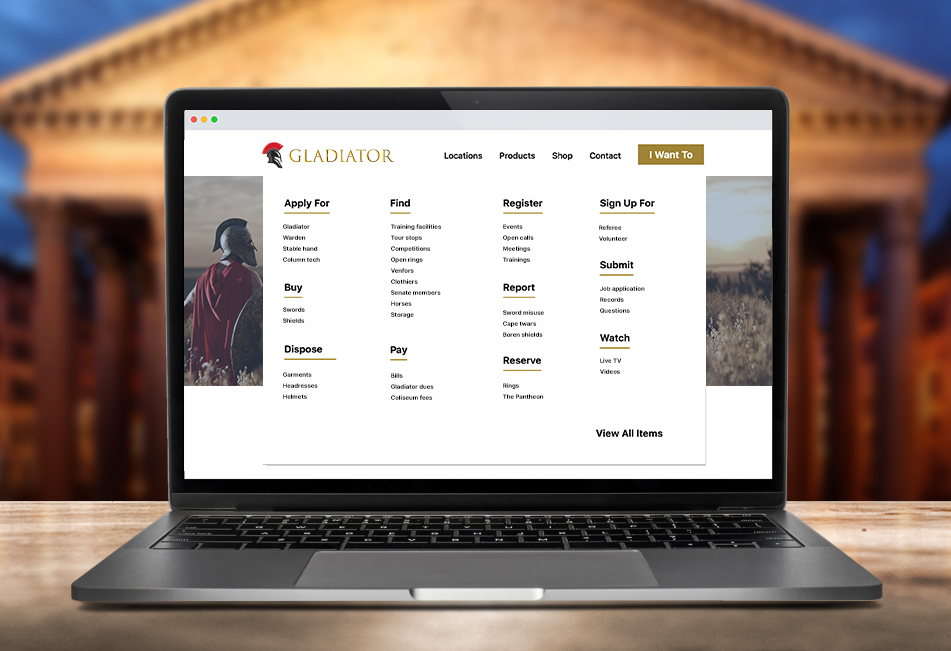
As mentioned, we'll be creating a mega menu for navigation in this sample. The "I Want To" button will serve as the source for the columns.
Since we're using Bootstrap to build our section, go ahead and copy and paste the links below in the head section of your project's HTML file:
HTML
Javascript
The JQuery code below makes the mega menu open when the "I Want To" button is clicked on. The menu is, by default, hidden. The code below used the JQuery toggleClass() method to add and remove/open and close classes to the menu items with children. You can copy and paste this code in your HTML file inside script tags, but you can also put it in a separate .js file such as navigation.js and link to that .js file:
CSS
The CSS code provides all the layout and styling for all the header components including media queries for responsive layouts. Since this is a mega menu, on desktop screens, multiple columns are shown side by side but we need to take tablet and mobile screens into consideration. For this reason, we set the column-count property to 4 on large screens and 1 on smaller screens. The column-count property in CSS specifies the number of columns a component will be divided into. This way, we will have 4 columns of lists on large screens and 1 column on smaller screens. We also don't want to show a long lists of links so for screen sizes below 768px, only the main category links will be shown with a "See all items" button at the end.
And there it is! Check out the JSFiddle below to see the demo before committing to its use:

Paris Tuzun
Contributions Editor here at Solodev. Want to be featured on the Solodev Blog? Get in touch.
Follow me on Twitter


