 Cloud
Cloud
 CMS
CMS
 AI
AI
 Blockchain
 Digital
 IoT
IoT
 Metaverse
 Mobile
Tutorial Tuesdays: How to Make a Browser Window with CSS
Designing a portfolio of website designs for customers can show prospective clients the quality of your work. However, creating image after image in various device templates can be a nightmare. Simplify the process by using CSS to create browser window containers.
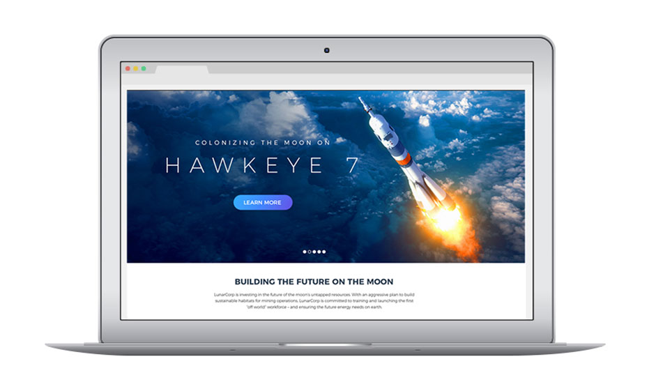

Showcasing your web design projects is a vital for any agency or freelancer. A portfolio of your designs can help prospective customers envision what’s possible for their individual projects. In many instances, you may want to showcase the responsive nature of a completed design. Usually, designers create a variety of images where they embed screenshots into a device overlay.
This method, however, can cause some headaches. What if your original photoshop or illustrator files disappear or are otherwise unavailable? What if your embed images need significant resizing to fit your template? Not to mention how time-consuming the whole process is. In these cases, you can spend potential hours for something that should only take a few minutes.
Save yourself the headache and try using CSS (via SCSS) to create your browser window containers. With this method, you can create device containers that mimic how your device would look on desktops, tablets, and phones. The CSS and underlying HTML will give you a standardized method of implementing these views saving you plenty of development/design time. Focus on perfecting a design for a client rather than worrying about where you’re saving countless embed images.
Below is the HTML and SCSS required.
HTML
The above HTML works with the use of two specific classes. For example, if you want to have your container mimic a tablet, then include both the "tablet-container" and "tablet-window" classes. The container classes will modify the width of the section, making it appropriate for the device in question. Anything within the window class will have the various background, padding, and border effects that mimic the device.
SCSS
The above SCSS will create all of the effects you need to mimic the most popular viewpoints. Each specific window class has its own background color, padding, shadowing, and border properties. Further, by taking advantage of "before" and "after" psuedo classes, you can add a number of details that make the device container realistic. For example, the desktop view has tab details and the phone view has camera/speaker details.
And there you have it, one easy way to spend less time worrying about countless images for clients and more time to design their dream website.

Elena Roig
Contributions Editor here at Solodev. Want to be featured on the Solodev Blog? Get in touch.
Follow me on Twitter


