 Cloud
Cloud
 CMS
CMS
 AI
AI
 Blockchain
 Digital
 IoT
IoT
 Metaverse
 Mobile
Media Queries and Mobile CSS Best Practices
Use these tips to better build responsive sites and make your CSS the envy of designers.


Nearly every month we’re reminded that a greater percentage of digital media is consumed on mobile devices. While that fact presents a number of different challenges to consider (how to best optimize content, creating effective mobile SEO strategies, choosing the right content management system, etc.), it also creates an underlying tension with your site’s CSS.
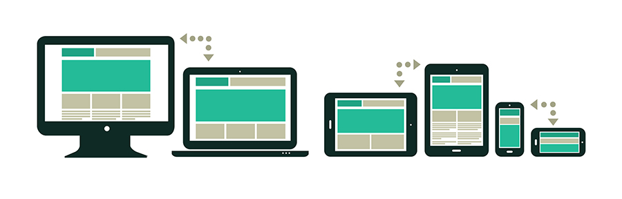
In the worst situations, your site’s CSS can balloon as you try to adjust to a host of different viewpoints and devices. Fortunately, years of responsive web design has translated into a number of best practices you can follow to prevent CSS bloat and make your site compatible to as many devices as possible.
Choose the Right CSS Breakpoints
Using the right breakpoints in your CSS media queries is likely the most important decision when implementing a fully responsive site. It would be impossible to create breakpoints for absolutely every device so, accordingly, some strategic planning is necessary.
A good place to start in this process is to mimic Bootstraps “mobile first” media queries which are defined as the following:
- Min-width: 320px (smaller phone viewpoints)
- Min-width: 480px (small devices and most phones)
- Min-width: 768px (most tablets)
- Min-width: 992px (smaller desktop viewpoints)
- Min-width: 1200px (large devices and wide screens)
Using these standard breakpoints, in combination with better organizing your CSS, will go a long way in keeping your stylesheets as clean and simplified as possible.
Ems and Percentages
When defining things such as margins, padding, and font sizes, many of us tend to revert to using the familiar pixels. However, using ems and percentages will make your responsive site easier to manage.
The obviously advantage of using ems or percentages is that it will drastically cut down on the need for media-query specific classes. In you haven’t fully adopted these elements into your stylesheet, begin to experiment and eventually transition over.
Design for Mobile from the Start
When designing a website, it’s tempting to start and focus on the full desktop version of the site. After all, at this viewpoint all of your elements will render and you can see the full scope of your site’s design. However, it’s simultaneously necessary to design the mobile site in parallel.
In creating a mobile mockup of the site along with the other important viewpoints, the development team will be able to better see how the different elements will realign and can plan accordingly. This will ultimately make your development proceed smoothly and will prevent having to go back and create unique CSS classes to adjust for responsive quirks.
Make Images Responsive
Images are one the first things website users focus on when viewing a site and this applies to mobile as well. But what does making images responsive mean? First, get rid of all your absolute widths. Rather, use the “max-width” property to set your absolute extreme and use “width: 100%” for your images. This will help scale your images better and prevent any images from exceeding the viewpoint of a given device.
Associated with this is to remove all inline styling and to double-check when adding an image via a WYSIWYG. By default, many WYSIWYG editors add fixed widths and heights to images. Before inserting an image, make sure no fixed properties are set and, rather, use images that have the appropriate dimensions.
Use Responsive Testing Tools
What would be web design and development without testing? There are a handful of tools that come in handy when testing responsiveness, including:
Browser Developer Tools
The trusted inspection and developer tools inherent in most browsers are typically the best place to start your responsive testing. With a handful of default viewpoints built in, you can start to see how all of your site’s different elements start to respond across a number of dimensions.
BrowserStack
www.browserstack.com
BrowserStack includes a ton of solutions for testing many different devices. Unlike developer tools which can only loosely emulate the responsive experience, BrowserStack provides a much more accurate experience of how different devices will render your site. In addition to device testing, BrowserStack also provides multiple browser versions to test to make sure your site is compatible.
GTmetrix
www.gtmetrix.com
It’s generally good practice to periodically run web page speed tests to ensure everything with your site is rendering as quickly as possible. Yet a given page will display at different speeds depending on the device used. GTmetrix allows you to test how a page will load on different browsers and different devices. This will help troubleshoot any potential issues that could arise with your mobile experience since it’s been proven that page speed is a key factor in determining user engagement.
While every website is different and your responsive strategy is ultimately dependent on your target audiences, it’s important to try to find as many areas as possible to standardize your CSS. Use the above tips to better build responsive sites and make your CSS the envy of designers.

Elena Roig
Contributions Editor here at Solodev. Want to be featured on the Solodev Blog? Get in touch.
Follow me on Twitter


