Skip to Content
Solodev Logo
  • Platform
    Platform
    Cloud icon

    Cloud

    Launch containers with SSO and monitoring

    Cube icon

    CMS

    Content Management Service for deploying CMS

    Person's profile icon

    AI

    Host AI models and train on a leading provider

    Crypto coin icon

    Blockchain

    Run a trusted network on your chain of choice

    Circle with arrows icon

    Digital

    Manage adtech, martech, and commerce apps

    Internet of Things icon

    IoT

    Connect and analyze devices and experiences

    Metaverse icon

    Metaverse

    Build worlds with AR and VR applications

    Image icon with a sexagon around

    Mobile

    Support for mobile apps and store listings

  • Pricing
  • Enterprise
Solodev Logo
Close Icon
  • Platform Angle right icon
    • Cloud icon Cloud
    • Cube icon CMS
    • Person's profile icon AI
    • Crypto coin icon Blockchain
    • Circle with arrows icon Digital
    • Internet of Things icon IoT
    • Metaverse icon Metaverse
    • Image icon with a sexagon around Mobile
  • Explore Angle right icon
  • Marketplace Angle right icon
  • Careers Angle right icon
  • Contact Us Angle right icon
  • Connect

Terms

Privacy Policy

How to Organize Your Links Using Bootstrap Columns


Providing quick links from your homepage is a great way to help your visitors find the most needed sources on your website without having to search for them.

How to Organize Your Links Using Bootstrap Columns
Build the perfect cloud stack today. Shop the Marketplace.

In this tutorial, we'll show you how to organize your links using Bootstrap columns and add a distinctive functionality by linking to both the subpages of a website and their subcategories in one neat column.

Getting Started

Copy and paste the Bootstrap source links below to install Bootstrap in your project:

HTML

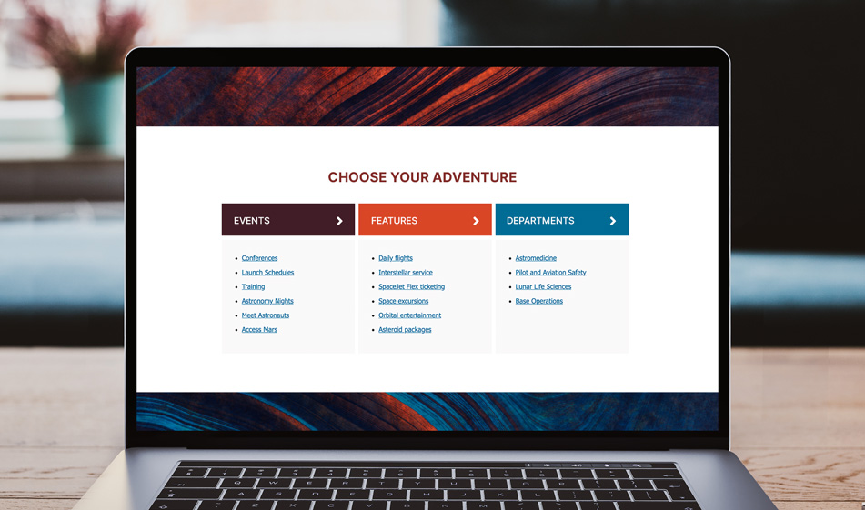
In the code below, we have three sectional boxes and each of them is labeled with a different color such as blue, red, and green. These will make up our three different columns. Each column has a link to the main page and a list of sub-links belonging to that page, for example, the last green column is a Departments column with a direct link to the main department page and underneath that, a list of department names. The main department link is inside an h2 heading and it is slightly spaced apart from its sublinks. This gives the users the option to both go to the departments' index page directly or select one of the individual departments.

CSS

Now that we built the HTML structure for the columns, it's time to set the layout, direction, and styling of the columns.

First, we make sure that we use Flexbox on the row elements. Flexbox is a CSS layout method that efficiently lays out, aligns and distributes elements. It saves a lot of time and frustration by eliminating the need for using floats and too many media queries for responsive layouts. We select all the row elements and the sectional-box elements inside them and give the attribute: display: flex;.

Then for the columns, we use flex-direction which is a Flexbox property that sets the direction of the main axis. Under .ct-sectional-box we add the property and value flex-direction: column. The flex direction is automatically set to row so we make sure now they're laid out in a column direction. We also set the same rule for screen sizes below desktop to ensure that the flexbox direction doesn't change. When the screen size is small, each column will automatically take up the full width. T

hen we add the styling by specifying the colors:

And there it is. Check out the JSFiddle below to see how it looks before committing to its use:

Download from Github

Share on Facebook Tweet It

Paris Tuzun
Contributions Editor here at Solodev. Want to be featured on the Solodev Blog? Get in touch.
Follow me on Twitter

RELATED POSTS

How to Make your Hero Image the Hero of your Webpage

How to Make your Hero Image the Hero of your Webpage

Three Common Website Issues and How to Survive Them

Three Common Website Issues and How to Survive Them

Five Tips to Building Landing Pages that Convert

Five Tips to Building Landing Pages that Convert

How to Edit Meta Information with your Solodev Website

How to Edit Meta Information with your Solodev Website

  • web design
    • Bootstrap
    • Form Tutorials
    • Navigation
    • Search
    • Sliders
    • Social
  • digital marketing
  • solodev
    • API
    • User Permissions
  • customer experience
  • accessibility
  • seo
  • analytics
  • sem

Sign up to explore

Create an account in seconds and start building today.

Sign up for Solodev

Join the list

Get the latest updates on cloud, AI, and more.

Community

Connect with Solodevs across the social universe

  • X Icon
Solodev Logo footer

Solodev helps developers around the globe build amazing customer experiences and collaborate on digital transformation, from code to cloud. The Solodev Platform provides the most complete ecosystem for developing apps and launching brands powered by cutting-edge technologies—including Cloud, CMS, AI, Blockchain, Digital, IoT, Metaverse, and Mobile.

Platform

  • Cloud
  • CMS
  • AI
  • Blockchain
  • Digital
  • IoT
  • Metaverse
  • Mobile

Explore

  • Pricing
  • Marketplace
  • Enterprise
  • AWS

Company

  • About Us
  • Media
  • Blog
  • Careers
  • Contact Us

©2025 Solodev. All rights reserved worldwide.

Terms Privacy Policy
Solodev logo
GET STARTED

Fill out the form to speak with a Solodev Advisor

BUY NOW

Fill out the form and one of our launch engineers will contact you soon

Set datatable type to be Form to show.

We use cookies to provide and improve our services. By using our site, you consent to cookies. Accept Learn more