 Cloud
Cloud
 CMS
CMS
 AI
AI
 Blockchain
 Digital
 IoT
IoT
 Metaverse
 Mobile
How to Make the Ultimate Breadcrumb Navigation and Share Bar
Put navigation tips and social media in one location with this handy breadcrumb navigation and share bar tutorial.
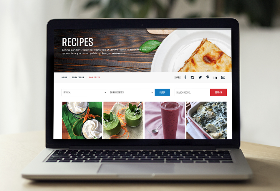

We've talked before on this blog about the importance of breadcrumbs for your website's navigation strategy. We've also written a number of times about the importance of social media linking on your website.
Today's tutorial combines both of these key elements into one location for your website visitors in the ultimate breadcrumb navigation and share bar. On the left side of the bar, you'll find the navigation elements and on the right side will be all the important social channels attached to your website and brand.
Overall, this helps consolidate your breadcrumb bar or designated section. Often, breadcrumbs leave a lot of empty space within your design. By combining it with some social share options, you not only fill in the space for a more balanced look, but you also insert crucial user engagement options that allow you to help spread your content around the web.
HTML
The HTML uses default Bootstrap classes for the layout and positioning of items. It also relies on Font Awesome for the various social icons:
Also of importance in the above HTML is the the fact that the last breadcrumb (the page that you would be on) is demarcated differently. This visual clue helps users ground themselves and know where they are within the framework of your sitemap.
CSS
The CSS itself it rather minimal, mostly affecting the styling of the text of the breadcrumbs and the spacing between the various items:
The "fileTrailCurrent" class is our active class or the one that represents the given page a user is on. There's also the use of additional font-weight properities to make some specific items stand out and help differentiate them to user eyes.
Want to see how this functionality could look on your site before you invest the time in coding? Try it out first in the JSFiddle below! Don't forget to adjust the browser window at a variety of sizes to see exactly how the website responds in mobile format!

Scott Madara
Contributions Editor here at Solodev. Want to be featured on the Solodev Blog? Get in touch.
Follow me on Twitter


