 Cloud
Cloud
 CMS
CMS
 AI
AI
 Blockchain
 Digital
 IoT
IoT
 Metaverse
 Mobile
How to Layer Profile Images Over One Another
If you need to show a list of users, members, or anything similar, try displaying profile images over one another to both conserve space. This also creates a feeling of connection among those users.


When you have a list of people on your website, sometimes displaying their profile images may not fit the space you have available. With a simple CSS layering trick, you can arrange these images in a way that would conserve less space. Layering the profile images over one another will also strengthen the group feeling (?) in a member group space. In this tutorial, we'll show you how to build a list of profile images and layer them on top of each other.
Getting Started
We're using Bootstrap to build our structure so we'll begin by adding Bootstrap to our project. Copy and paste the Bootstrap CDN below in your project:
HTML
Below we have a Bootstrap column and inside a table. Since we have multiple column headers and horizontal row items, we used Bootstrap tables. Bootstrap tables are very practical if you need multiple rows and column headers. They also come with pre-built classes and styles. This is for practicality purposes only so if you'd like to, you can also use div containers or ul/li lists in your project. Take a look at the code below:
Inside the td tag there are 5 div containers for 5 profile images. Each div has a title. This is because there are no names listed with the images so when an image is hovered over, the title will tell the name of the person.
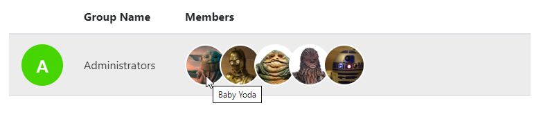
Also, note that we added a rounded-circle class for each image div to make the images round. In Bootstrap, the rounded class makes an element's corners round and the rounded-circle class automatically makes images circle. If you don't wish your images to be round, you can omit this classname in your project.
CSS
Now that we build the HTML structure, it is time to actually make the images layered on top of each other. We created a special classname of .member-overlap-item for all the image containers. In our CSS file, we simply select that class and add a margin-right rule. In our example, we set the margin-right rule to -10px. That way, each image will overlap 10px towards the left size. You can increase or decrease this value depending on how much you want each image to overlap the image next to it. Finally, we applied a 2px solid white border for each image. The border is not a must to include but it shows an image's boundaries and it helps separate where each image ends and where the other begins.
There it is. Check out the JSFiddle to see how it looks before committing to its use.

Paris Tuzun
Contributions Editor here at Solodev. Want to be featured on the Solodev Blog? Get in touch.
Follow me on Twitter


