 Cloud
Cloud
 CMS
CMS
 AI
AI
 Blockchain
 Digital
 IoT
IoT
 Metaverse
 Mobile
How to Integrate Tabs into Your Content with a Page Navigation Toolbar
You may find that you have too much page content to ideally fit a single page. Rather than creating a series of child pages, however, you can include a Page Navigation Toolbar that allows you to tab between content on a single page.

When you have a lot of content on a single webpage, it is a good idea to divide them into separate tabs. Tabs are very intuitive for the users since people are accustomed to using real-life tabs to organize their files and folders. Digital tabs follow the same structure. In this tutorial, we'll build modular tabs that divide sections within a single web page as opposed to navigational tabs which lead the users to different webpages on the site.
There are two important things to pay attention to when integrating modular tabs:
- The information that is divided into tabs needs to be categorically similar. If you feel like the sections you put inside the tabs don't belong on the same web page, put those sections on another page.
- Pay attention to the page's size. Pages with a lot of content get loaded slowly especially on mobile devices. Since the content gets divided into tabs, it is easy to get carried away and put a lot of content inside each tab but don't forget that whether you have a page without tabs or many tabs, the time to load the content will be the same.
Now that we talked about the function of tabs and how to use them, let's get to how we can build them. Bootstrap makes it very easy to build tabs. All you need to do is put the below CDN links inside the head section of your HTML file:
The Bootstrap CSS and JS files will provide you with all the technical foundation to build tabs. In Bootstrap tabbed navigation, the basic structure is simple. It is composed of two main elements: The nav component for the tab label list and the tab-content component for the tab content list. The .nav component is used to build all kinds of navigational elements and inside the .nav component, there are .nav-items to name the tab label items. To contain all the tab contents, the .tab-content class is used and for each individual tab .tab-item class is used. Basically, the structure goes like this:
Here's our full HTML code for the tabbed list we built:
We didn't use any additional CSS as Bootstrap provided the basic CSS styling but if you would like to further style your navigation, you can create a CSS file to add your custom CSS.
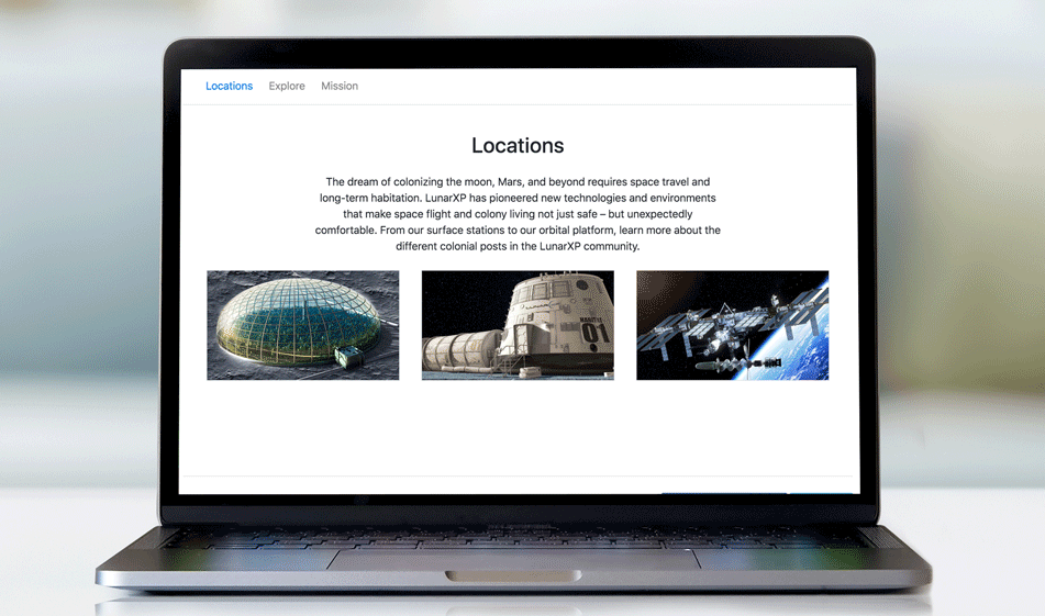
There we go, our basic Bootstrap tabs to house our page's sections:

Paris Tuzun
Contributions Editor here at Solodev. Want to be featured on the Solodev Blog? Get in touch.
Follow me on Twitter


