How to Design a Testimonial Slider
Your customers and clients love your brand, and they even admitted it online! Showcase those statements in this stylish testimonial slider tutorial.
It’s a nice feeling to hear your customers say pleasant things about your business and they’re experience with your brand. Testimonials speak to the power of your product, sure, but more often than not, they establish a brand trust deeper than any five-star review. They’re also the most powerful form of marketing, with over 88 percent of marketers saying that a testimonial or referral from another client helped them land new business. Testimonials can lead to word-of-mouth marketing -- one of the most coveted ways for any business to establish brand trust and loyalty.
It’s great to have your website listed on review sites like Yelp and to monitor social media discussion around your brand. However, your testimonials should ultimately live where they’ll have the biggest impact on your potential buyers -- on your website. We strongly recommend putting your tutorials on the homepage. Seeing that other people validated your company could drive potential customers further into your website -- ideally to the product pages.
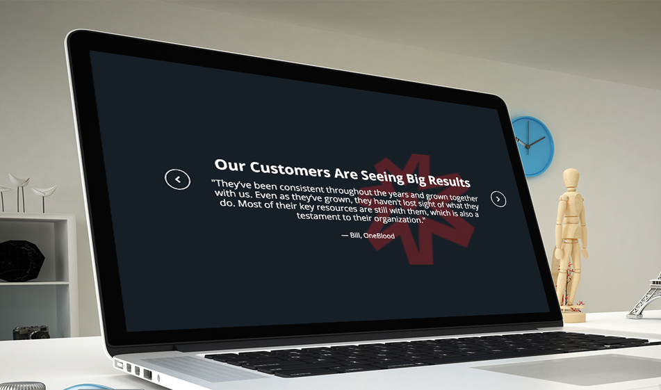
One of the most functional ways to display your testimonials is in a slider. This tutorial will show you just how simple it can be to add this potentially conversion-increasing element:
HTML
The HTML here uses Bootstrap 4 heavily, focusing on the text alignment, spacing, and typography.
<section class="testimonials py-5 text-white px-1 px-md-5 margin-top-xl">
<img src="https://raw.githubusercontent.com/solodev/testimonial-slider-fullwidth/master/solodev-logo-stacked.png" class="icon-overlay" />
<div class="container">
<div class="row">
<div class="col-sm-12">
<h2 class="pt-2 text-center font-weight-bold">Our Customers Are Seeing Big Results</h2>
<div class="carousel-controls testimonial-carousel-controls">
<div class="control d-flex align-items-center justify-content-center prev mt-3"><i class="fa fa-chevron-left"></i></div>
<div class="control d-flex align-items-center justify-content-center next mt-3"><i class="fa fa-chevron-right"></i></div>
<div class="testimonial-carousel">
<div class="h5 font-weight-normal one-slide mx-auto">
<div class="testimonial w-100 px-3 text-center d-flex flex-direction-column justify-content-center flex-wrap align-items-center">
<div class="message text-center blockquote w-100">"They’ve been consistent throughout the years and grown together with us. Even as they’ve grown, they haven’t lost sight of what they do. Most of their key resources are still with them, which is also a testament to their organization."</div>
<div class="blockquote-footer w-100 text-white">Jim Joe, WebCorpCo</div>
</div>
</div>
<div class="h5 font-weight-normal one-slide mx-auto">
<div class="testimonial w-100 px-3 text-center d-flex flex-direction-column justify-content-center flex-wrap align-items-center">
<div class="message text-center blockquote w-100">"Miami Beach Visitor and Convention Authority uses Solodev to craft a website capable of representing its diverse residents. The website features a newsroom with the latest events, an interactive calendar, and a mobile app that puts the
resources of VCA at a user’s fingertips."</div>
<div class="blockquote-footer w-100 text-white">Jim Joe, WebCorpCo</div>
</div>
</div>
<div class="h5 font-weight-normal one-slide mx-auto">
<div class="testimonial w-100 px-3 text-center d-flex flex-direction-column justify-content-center flex-wrap align-items-center">
<div class="message text-center blockquote w-100">Solodev is a great company to partner with! We are extremely happy with the software, service, and support.</div>
<div class="blockquote-footer w-100 text-white">Jim Joe, WebCorpCo</div>
</div>
</div>
</div>
</div>
</div>
</div>
</div>
</section>
CSS
Since so much of the styling is being implemented by Bootstrap 4's classes, the CSS can cleanly focus on custom design and perfect responsivity.
xxxxxxxxxx
body {
font-family: "Open Sans", sans-serif;
}
.testimonials {
overflow: hidden;
position: relative;
max-height: 300px;
}
.testimonials {
background: #161d25;
}
.one-slide,
.testimonial,
.message {
border: none !important;
outline: none !important;
}
.icon-overlay {
position: absolute;
opacity: 0.3;
right: 10%;
top: 0;
height: auto;
width: 100%;
max-width: 400px;
}
.carousel-controls .control {
position: absolute;
transform: translateY(-50%);
width: 45px;
height: 45px;
border-radius: 50%;
border: 2px solid #fff;
z-index: 1;
}
.prev {
left: -2.25rem;
}
.next {
right: -2.25rem;
}
@media screen and (max-width: 768px) {
.testimonials {
max-height: 700px;
}
.icon-overlay {
height: 300px;
top: calc(50% - 150px);
}
.carousel-controls .control {
width: 25px;
height: 25px;
top: inherit;
}
.prev {
left: 0;
}
.next {
right: 0;
}
.control i {
font-size: .7rem;
}
.testimonials .message {
font-size: 1rem;
}
.testimonials h2 {
font-size: 1.5rem;
}
}
JS
A short call to Slick Slider and some custom JSON settings allow you to create the functionality you desire for your slider.
xxxxxxxxxx
$(document).ready(function() {
$(".testimonial-carousel").slick({
infinite: true,
slidesToShow: 1,
slidesToScroll: 1,
autoplay: false,
arrows: true,
prevArrow: $(".testimonial-carousel-controls .prev"),
nextArrow: $(".testimonial-carousel-controls .next")
});
});
Want to see how this testimonial slider could look on your site before you invest the time in coding? Try it out first in the JSFiddle below!