 Cloud
Cloud
 CMS
CMS
 AI
AI
 Blockchain
 Digital
 IoT
IoT
 Metaverse
 Mobile
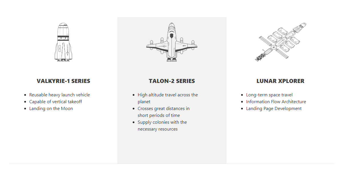
How to Create Bordered Services Boxes with Bootstrap
To emphasize the division between default bootstrap columns, you may want to add borders to separate content with clean design. This also gives you the freedom to use hover properties.
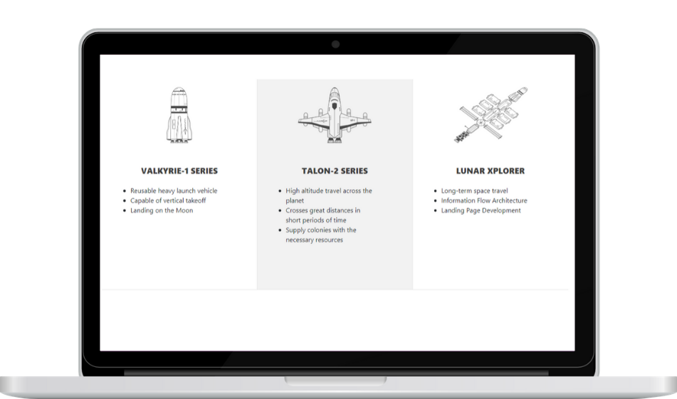

Columns add readability and visual appeal to a website and Bootstrap's grid system, it is very easy to create a column layout and display your products and services in a cleaner way. In this tutorial, we'll show you how to create a three-column Bootstrap layout to display your list of products/services.
Getting Started
Before we build our HTML structure, we need to get Bootstrap. Copy and paste the code below to add Bootstrap CDN to your project:
HTML
After we add Bootstrap to the project, we build the structure for the three-column layout. We have a container div with a classname of services-wrapper. You can name this container any way you'd like. This will be the main wrapper container for the column layout. Inside, the column structure follows the standard Bootstrap column grid system:
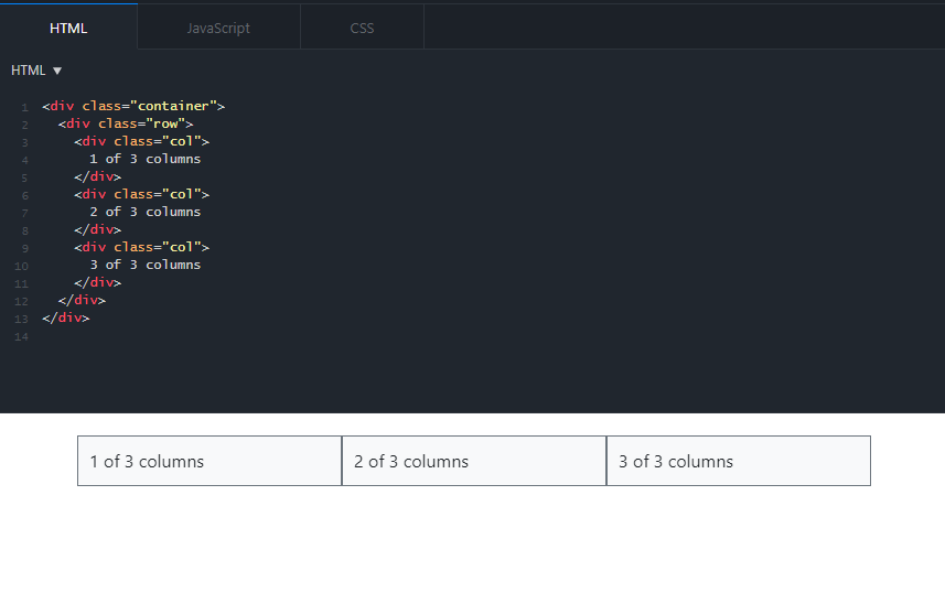
Since we'll have three columns, we gave each service box column a classname of col-4. Inside each column there is:
- A div container with a classname of service-icon for the image,
- A div container for the subheading,
- A div container for the features or service details list.
Note that in the last third column, we added an additional classname of "last". This is because the third column won't have a border on the right. We'll add a CSS rule for that in the next section.
CSS
After we build the column layout in HTML, the CSS is pretty straightforward. In the code below, we made minor font and size adjustments. We add the borders to the right of the columns by writing:
border: 1px solid #e5e5e5;
border-left: 0;
border-top: 0;
We mentioned adding a special classname for the last column. We don't want a border on the right side of the last column so in the CSS file, we select the classname last then add the following rule:
.services-box.last { border-right: 0; }
If you have multiple rows and plan on adding more boxes to your page, you can also use the nth-of-type(n) CSS pseudo-class to select every 3rd column in the grid i.e.:
div:nth-of-type(3n) { border-right: 0; }
Finally, for the hover state, we select each column and add a hover state by writing:
.hoverServices:hover { background-color: #f2f2f2; }
And there we have it. Check out the JSFiddle below and re-size the browser to see how it looks on different screen sizes:

Paris Tuzun
Contributions Editor here at Solodev. Want to be featured on the Solodev Blog? Get in touch.
Follow me on Twitter


