 Cloud
Cloud
 CMS
CMS
 AI
AI
 Blockchain
 Digital
 IoT
IoT
 Metaverse
 Mobile
How to Create an Expandable Sidebar Navigation Links
Do your navigational elements do too much? Offset potentially overwhelming menus by using an expansive sidebar for an added navigational element.
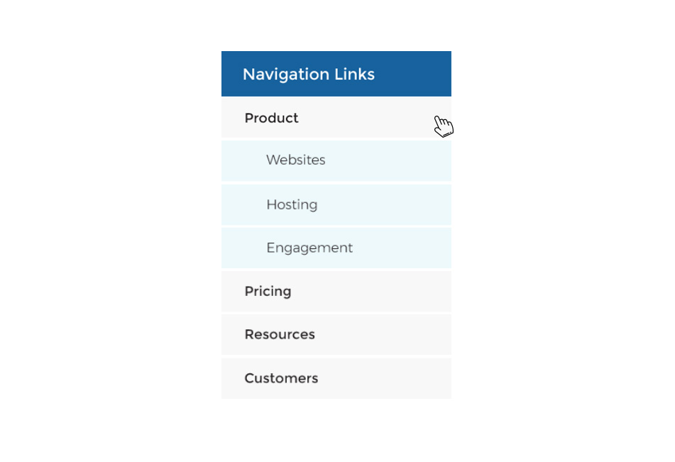

Navigation is a critical part of UX design, but sometimes, there are so many navigation options that's things like mega menus simply aren't functional. In those moments, it's often easier to break up the navigational elements as to not overwhelm a user.
Such moments can become quite apparent when using navigational links in your template's sidebar, aside, or other secondary template element. A unique way to streamline, but still include all necessary links, in your sidebar navigation is to make your primary, top-level links expandable/collapsible. With this method, users can clearly get to the links and sections they need, and yet you preserve your design and prevent long lists from displaying by default.
With this tutorial, you will get all of the needed HTML, CSS, and JS to create these expandable/collapsible navigational elements.
HTML
The HTML here uses un-ordered, un-styled list within another to specify where to put the sub-items.
CSS
Some general styles for the navigation.
JS
The Javascript/jQuery code here uses DOM traversing and matchHeight to give the elements the desired functionality when we want them.
Want to see how this tutorial could look on your site before you invest the time in coding? Try it out first in the JSFiddle below! Make sure to click on each element to see how the expand/collapse functionality looks.

Scott Madara
Contributions Editor here at Solodev. Want to be featured on the Solodev Blog? Get in touch.
Follow me on Twitter


