 Cloud
Cloud
 CMS
CMS
 AI
AI
 Blockchain
 Digital
 IoT
IoT
 Metaverse
 Mobile
How to Create a Flyout Bootstrap Modal
By default, bootstrap modals will appear in the center of the screen with a slight animation from top-down. However, depending on your UI or overall design, you may want to have modals flyout from the sides.


Bootstrap Modals are Javascript powered lightboxes that you can use for various purposes such as alerts, popovers, tooltips, and pop-up forms. Modals come up pre-built classes for positioning such as vertically centering the modals. Once a modal is activated, it will usually slide down and fade in from the top of the page. If you'd like to make a modal slide from other directions though, you'll need to use custom CSS. In this tutorial, we'll show you how to make a Bootstrap modal slide from the side. With the techniques in this tutorial, we can actually go a step further and make a modal function as a side navigation menu.
Getting Started
Since we're using Bootstrap, first we need to include the Boostrap files in our project. Copy and paste the Bootstrap CDN code below in your project's HTML file:
Note: JQuery link must come before the Bootstrap's Javascript links otherwise Bootstrap's Javascript code will not work.
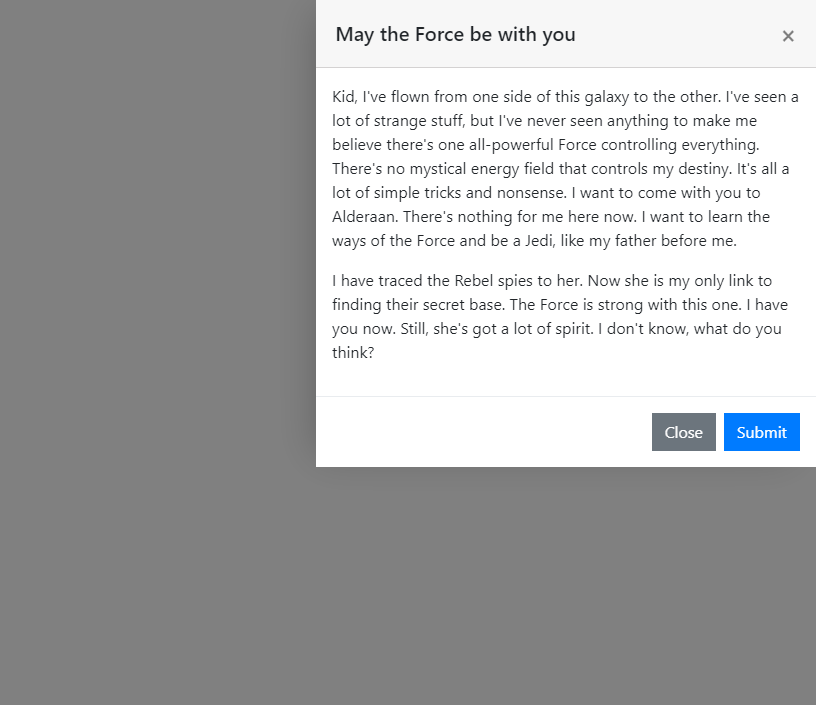
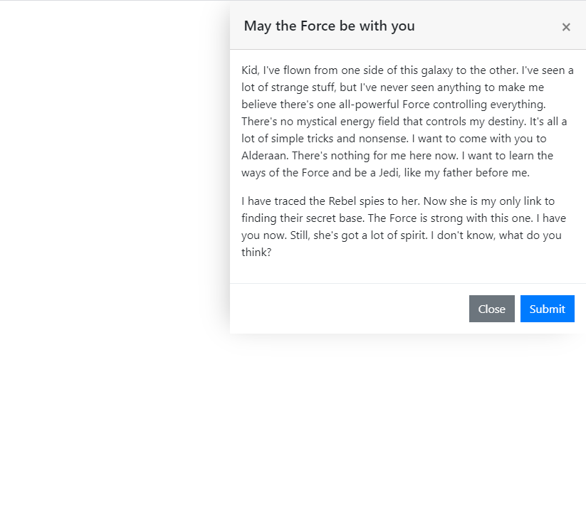
Bootstrap Modal Structure
Bootstrap modals have standard components inside a div component with a classname of .modal-component:
- The modal header: Includes the modal title.
- The modal body: The main modal content goes over here.
- The modal footer: Includes the "Close" and "Save Changes" buttons by default. You can edit and customize these buttons.
Below is a basic Bootstrap modal structure:
In order to trigger the modals, a button or a link is needed:
So basically, creating a modal requires two elements: A button to trigger the modal and the modal component. Here's the complete code for our example modal. Inside the modal we have a filler title and a sample paragraph content. Copy the code below, paste it in your HTML file and customize the modal content as you'd like:
CSS
Once we're done building the HTML structure of the modal, it is time to actually make it slide from the sideways. We'll do this by using the CSS @keyframes rule. In CSS, the @keyframes rule is used to create animations. It allows an element to gradually change by setting keyframes or waypoints along the animation sequence. Just like CSS gradients, it has a start and an end point such as 0% and 100%. The @keyframes rule is immediately followed by an identifier; this identifier binds the animation to that element. We're making the modal slide in from the right side so for convenience purposes, we named the identifier fadeInRight and set the animation-name property to fadeInRight as well:
Next, we put the fadeInRight identifier right after the @keyframes rule and set the from and to values. Initially, we set the opacity of the modal to 0% since it will be transformed from invisible status to visible. Then we use the translate3d property to set the initial positioning the modal. The syntax for the translate3d() property is as follows:
translate3d(tx, ty, tz) with x,y,z corresponding to X,Y,Z axes.
Since the modal will show up from the right side, initially the right-side position should be 0 and then move gradually towards the end of its container. This means it will only move horizontally (on the x-axis) so we'll set the initial positioning as (0,0,0) and the end positioning as (%100,0,0).
Finally, we'll set a duration for the animation to make the transition smooth. In the HTML section, we added an .animated class to the modal container. We select this classname in our CSS file and set the animation duration to 0.5s. The higher this number, the longer time the animation will take to complete.
Our modal is now sliding from the right instead of top. Remember we mentioned going a step further and making the modal function like a side navigation menu? There is a simple trick to accomplish this: by removing the dark modal background overlay. Whenever a modal opens, Bootstrap automatically inserts a dark background overlay with a classname of .modal-backdrop. We can remove this dark overlay by setting its background-color to transparent. Below is the difference between dark overlay vs transparent overlay:
Dark Overlay
Transparent Overlay
And there it is. Click on the "Launch Modal" button on the JSFiddle example below to see how it works before committing to its use:

Paris Tuzun
Contributions Editor here at Solodev. Want to be featured on the Solodev Blog? Get in touch.
Follow me on Twitter


