 Cloud
Cloud
 CMS
CMS
 AI
AI
 Blockchain
 Digital
 IoT
IoT
 Metaverse
 Mobile
How to Create a Featured Section for Your Website
When people visit your website, you need to be able to make a good impression quickly and display your best work in a prominent place. Capture the attention of your visitors with a well-designed featured section and encourage them to check out the rest of your work.
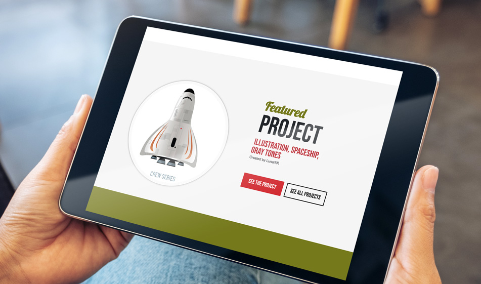

Whether you want to display your best portfolio piece or your featured blog post, creating a well-designed featured section will draw the attention of your visitors and make your content stand out. In this tutorial, we'll show you how to create a visually compelling featured section using custom free Google fonts and Bootstrap.
Getting Started
The links below include Bootstrap files and custom Google fonts. Copy and paste them in your project's HTML file:
Note: If you wish to use other Google fonts, you can visit this link, pick the font you like and include it as a stylesheet link.
HTML
The HTML code below is made using the Bootstrap grid and has two parts: the image container and the text. The image container is a div container inside a .col-md-7 and the text container is inside a .col-md-5 column. If you'd like to make your image smaller and text larger, you can change these column sizes. There is an h2 heading divided into two tags: small and span. With these tags, we can have one main h2 title but we can adjust the style of each word in our heading. The small tag will have a smaller font size and different font and color while the word inside the span tag will be bigger. These minor customizations can create different interesting and different typography.
Underneath that, we have an h3 tag that we use for tags for the project. We also put two buttons under the text, one button to see the featured project. Inside the a tag, the link address leads to that specific project but we also provided a button to see all projects so that your visitors can go to the main page where they can see all your works.
CSS
This is the most important part. With CSS, we determine the necessary kind of styling: color, font family, font size and the line heights along with proper spacing of the words. We also need to adjust the spacing of the columns for different screen widths. Copy and paste the CSS code below and feel free to change the colors and the font families to match them with your branding style:
And there it is. Check out the JSFiddle below to see how the featured section works before committing to its use:
Paris Tuzun
Contributions Editor here at Solodev. Want to be featured on the Solodev Blog? Get in touch.
Follow me on Twitter


