How to Create a Contemporary Shopping Cart Layout Using Bootstrap Cards
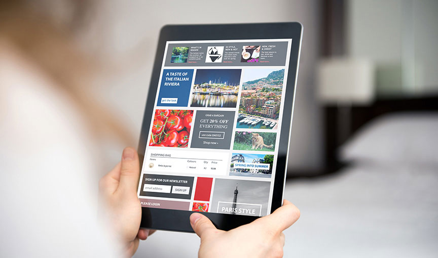
Shopping carts demand intuitive and simple designs that users can quickly comprehend. Using Bootstrap cards, you can implement a layout that meets these demands.


Building product pages can be made easy thanks to Bootstrap. Bootstrap has all the tools and built-in features available such as cards, and its cards are very versatile. They can be used in many ways such as displaying a list of services, an organized list of links inside boxes, and as we will see in this tutorial, building product cards for online store pages. Cards in Bootstrap have several sections: header, card body that includes the main card text content, footer, and links. This makes the Bootstrap cards ideal to create product lists as it is very easy to add a product description, product image, product description and a button.
Getting Started
First, add Bootstrap in your project simply by placing the CDN link below in the head section of your HTML file:
The Card Structure
Here is the basic structure of the product cards we'll be building:
Since we will place three products horizontally, we used the col-md-4 grid class to place three equal-width columns across. If you'd like to list more products horizontally, change the column size. The card-container class is not a part of the card component in Bootstrap. We created that to pick each card and style it.
HTML
Here is the complete code to create three product listings. Each section, the title, the image, the price etc. is inside a div container. You can switch the order of the image and title or other sections by copying and pasting the entire div container in other places.
CSS
The CSS is only a few lines in our example since we took advantage of the built-in Bootstrap classes and using them inside HTML. For example, px to add left padding and a right padding, border-0 to the card class to remove all the borders from the card component (if you'd like to put a border around the cards, remove this class), img-fluid to make the images scale appropriately inside their container, w-100 and h-100 to make the elements' widths and heights 100%. These are some of the classes we used. You can remove or add classes to customize the cards as you see fit. Therefore, our stylesheet is very light with only minor stylings.
Using different background colors for the body and the product cards is really important as the different color and a color contrast will help differentiate the cards from the background as well as the other cards.
And there it is. Check out the JSFiddle below to see how it looks:

Paris Tuzun
Contributions Editor here at Solodev. Want to be featured on the Solodev Blog? Get in touch.
Follow me on Twitter