 Cloud
Cloud
 CMS
CMS
 AI
AI
 Blockchain
 Digital
 IoT
IoT
 Metaverse
 Mobile
How to Craft a Featured Sectional for Your Blog
Your blog is one of the most important elements of your content marketing strategy. Here's how to showcase your blog's content elsewhere on your website to draw more readers to your blog.

If you operate a website, there's a good chance you also operate a blog associated with that website.
And if you don't operate a blog, you could be missing out on one of the most profitable and lowest-cost marketing inbound marketing strategies around. Blogging boosts SEO and traffic from search engines and establishes your company's voice as a thought leader. It can also boost leads, bringing in as much as six times more leads with a blog than without.
But this post isn't for those still stuck in 2004 who lack a business blog and don't want to invest in content marketing. This post is for those who love their blog, but they just need an easy way to showcase just how good their content is.
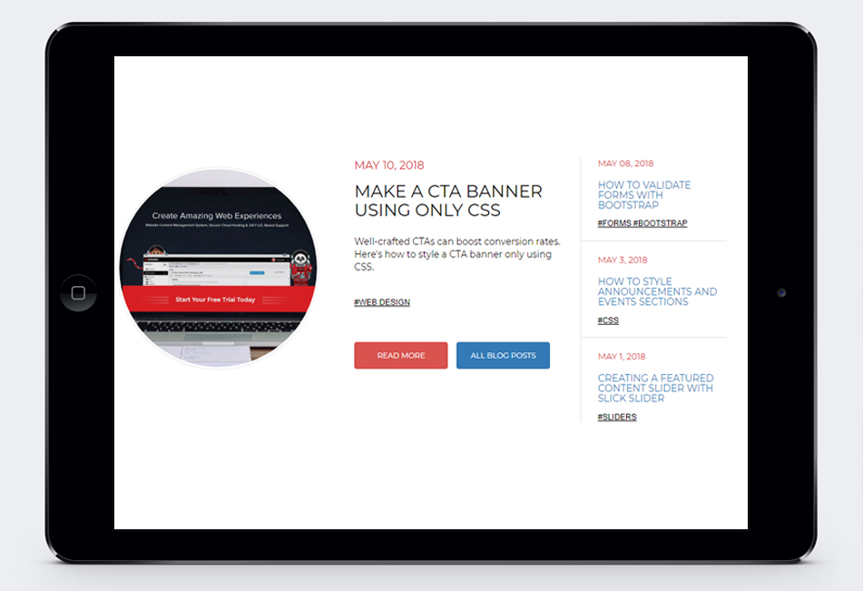
One of the best ways to bring readers to your blog from your website's homepage is to feature blog content on eye-catching sectionals. Those sectionals typically include a featured image to boost engagement and a list of the most recent blog posts to give your visitors a choice in what they want to read.
Remember, this blog sectional will typically live on your website's homepage or similar location, so you'll have to show off these elements in a very limited amount of space.
There are a few things that need to be included on your featured sectionals (regardless of where it lives):
- Title of post
- Date published
- Brief intro or synopsis
- Category and relevant tags
- Featured image
HTML
The HTML makes heavy use of various bootstrap column classes in order to reposition elements according to the appropriate screen size. This, ultimately, helps accommodate the featured post's image.
CSS
Considering the unique styling of this sectional piece, there's an appropriate number of custom classes used to format everything responsively.
Want to see how it all looks before committing to its use? Check out the JSFiddle below. Be sure to scale your browser windows to various sizes to see how these sections would look on mobile display.

Scott Madara
Contributions Editor here at Solodev. Want to be featured on the Solodev Blog? Get in touch.
Follow me on Twitter


