 Cloud
Cloud
 CMS
CMS
 AI
AI
 Blockchain
 Digital
 IoT
IoT
 Metaverse
 Mobile
How to Convert a Sidebar Navigation to Dropdown with Bootstrap
Sometimes, sidebar navigation can present more problems than solutions -- especially on mobile. With Bootstrap classes, however, you can convert a potentially long list into a convenient dropdown menu for mobile functionality.


On responsive displays, normally when the screen size gets smaller, the sidebar moves under the main content. If the sidebar has a long list of navigation menu items, this can take up a lot of screen real estate -- especially on mobile screens and force people to scroll more. However, with Bootstrap's built-in classes, you can easily convert your sidebar to a dropdown menu and save a significant amount of space on the screen. In this tutorial, we'll show you how to turn a sidebar into a dropdown navigation menu with Bootstrap.
Getting Started
Copy and paste the external links below in the head section of your HTML file:
Understanding Bootstrap's Visibility Classes
Bootstrap 4 comes with so many helpful built-in classes to hide and show elements and within specified screen sizes. You can choose to show or hide certain elements on mobile, tablet and desktop screens. This responsive visibility allows us to show/hide elements without having to write additional media queries. Before we get to these responsive visibility classes, let's talk about Bootstrap's media queries and responsive breakpoints. Bootstrap has default screen size breakpoints:
// Small devices (landscape phones, 576px and up)
@media (min-width: 576px) { ... }

// Medium devices (tablets, 768px and up)
@media (min-width: 768px) { ... }

// Large devices (desktops, 992px and up)
@media (min-width: 992px) { ... }

// Extra large devices (large desktops, 1200px and up)
@media (min-width: 1200px) { ... }
They also go the other way:
// Extra small devices (portrait phones, less than 576px)
@media (max-width: 575.98px) { ... }

// Small devices (landscape phones, less than 768px)
@media (max-width: 767.98px) { ... }

// Medium devices (tablets, less than 992px)
@media (max-width: 991.98px) { ... }

// Large devices (desktops, less than 1200px)
@media (max-width: 1199.98px) { ... }
These 4 breakpoints are also abbreviated as (xs) for extra small, (sm) for small, (md) for medium, (lg) for large. There's also (xl) for extra large screen sizes with a minimum width of 1200px.
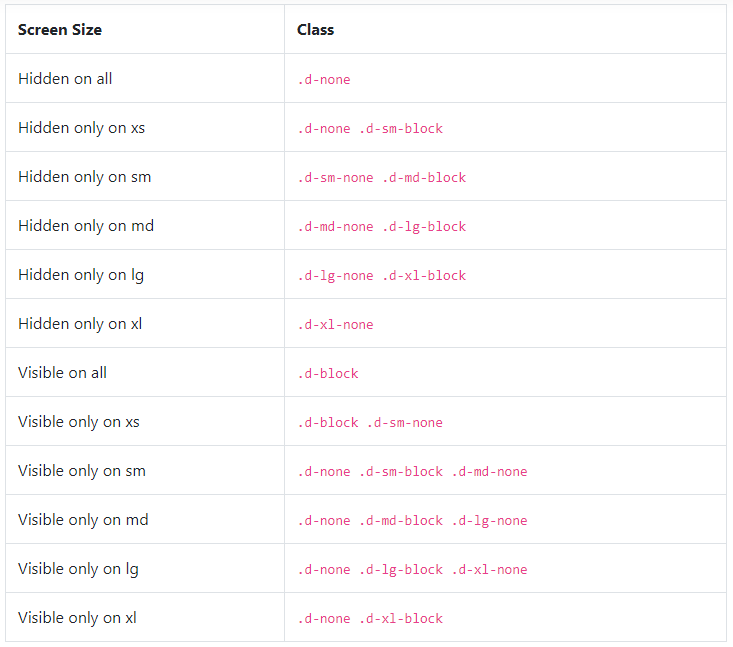
.d-none class in addition to the .d-{sm,md,lg,xl}-none classes for any responsive screen variation.
To show an element only on a given range of screen sizes we combine one .d-*-none class with a .d-*-* class, for example .d-none .d-md-block .d-xl-none will hide the element for all screen sizes except on medium and large devices. Below is a chart for all the responsive display classes:
Now that we explained the responsive display classes, it is time to go over the HTML code and structure of our sidebar menu:
HTML
Below we have a sidebar inside an aside tag. Inside the sidebar section, we have two components: the select dropdown menu with a classname of subMenuSelect and a regular ul list with an id of subMenu. The important thing to note here are the built-in Bootstrap classes each of these components are using. While the select tag has the classnames of d-block and d-lg-none, the ul list has the classnames: d-none and d-lg-block. As we explained above, the responsive display classes are used with .d-none classes. This means that the select tag won't be visible on any screen size above large(lg) or above 992px of width whereas the ul menu will only be visible only on large(lg) screen sizes.
CSS
Since we used many built-in Bootstrap classes in our HTML, the below CSS code includes mainly the visual styling of the elements. You can copy and paste it in your CSS file and customize it as you wish:
In this tutorial, we showed you how to display a sidebar as a dropdown menu with Bootstrap. In the JSFiddle below, you can click on "Edit this JSFiddle" link to go to the fiddle, then resize the result window to see how the sidebar switches to a dropdown menu:

Paris Tuzun
Contributions Editor here at Solodev. Want to be featured on the Solodev Blog? Get in touch.
Follow me on Twitter


