 Cloud
Cloud
 CMS
CMS
 AI
AI
 Blockchain
 Digital
 IoT
IoT
 Metaverse
 Mobile
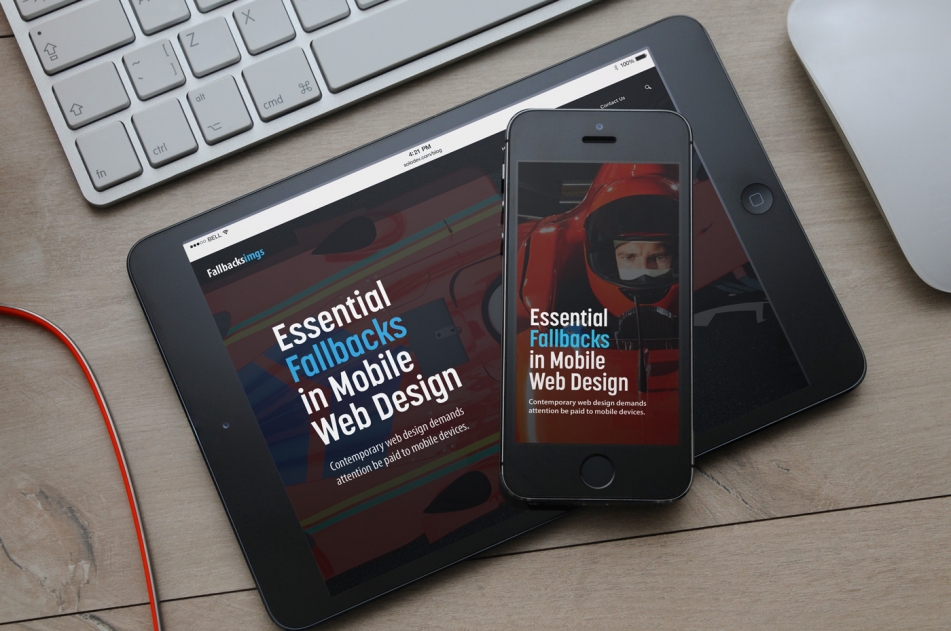
Essential Fallbacks in Mobile Web Design
There are a number of fallback options you can implement to deliver consistent user experiences across a number of devices and browsers.

Contemporary web design demands attention be paid to mobile devices. Creating mobile-specific wireframes, mockups, and designs certainly plays an important role in ensuring your website visuals are optimized for responsive design. Yet, you may encounter some structural issues underlying all of your front-end designs. This problem exists simply because there are a wide variety of mobile devices or browsers. These devices and browsers may render your elements differently or, worse yet, not at all.
Fortunately, there are a number of fallback options you can implement to deliver consistent user experiences across a number of devices and browsers. A “fallback” is nothing more than additional options to deliver to a browser in case a certain HTML tag, CSS property, or script cannot be rendered. Fallbacks are most commonly utilized with HTML5 tags and CSS3 properties, both of which are relatively new and may not be fully supported in some browsers.
Below are some tips and element-specific fallbacks that you can use in your web design project.
Video Fallbacks
The “video” HTML tag is a much needed upgraded to previous ways of using background videos. The only problem with this method is that some browsers may not support your video format. The video tag can be used to create elegant hero headers or other sections with a muted video playing in the background. It is generally recommended to use different video formats as a fallback option since some browsers only allow specific file formats. If all else fails, you can revert to a static image which will help preserve the consistency of your design.
Essential CSS Fallbacks
The latest CSS3 properties allow you to create stunning designs that were previously impossible to accomplish with basic styling. If using a CSS3 element, one of the easiest methods to insure browser compatibility is to list browser-specific prefixes such as “-moz” and “-webkit”. Take adding simple rounded corners with the “border-radius” property:
It’s a best practice to list the prefixes before the standard tag. When a browser processes your page, it will find the property that it can understand and will render that style. Find what tags you should use prefixes with at caniuse.com
Modernizr.js
If you want a complete solution, Modernizr is a collection of scripts which can detect the device and browser of a user, find incompatible elements, and automatically replace those with tags with alternatives that can render on the specific device.
Modernizr has the capability of checking for a whole host of features including context menus, event listeners, input elements, touch events, and HTML5 videos.
You can download Modernizr with the specific libraries you want to check for and then include it as a simple script.
Hide or Create Mobile Specific Sections
If using Bootstrap, you have the capability of easily hiding certain sections on mobile devices. Conversely, you can show certain elements on mobile devices only. This is a great way to resolve any styling issues you’ve encountered with your mobile design.
While it’s recommended to make all of your design elements fully responsive, there are occasions where something will need to be styled entirely differently on mobile devices. One of the most prominent of these cases is a hamburger menu which should only appear on small-screen devices.
With the use of the “visible-sm” and “visible-xs” options, this menu will only appear on devices with a width of 768px or smaller. You can you use the similar “hidden-sm” and “hidden-xs” classes to hide a specific element on mobile devices.
The world of web design, especially when it comes to responsive devices, can often feel like a chaotic world of mixed CSS properties and HTML elements. By following the above tips, however, you can better ensure your designs will be compatible with as many devices as possible.

Scott Madara
Contributions Editor here at Solodev. Want to be featured on the Solodev Blog? Get in touch.
Follow me on Twitter


