 Cloud
Cloud
 CMS
CMS
 AI
AI
 Blockchain
 Digital
 IoT
IoT
 Metaverse
 Mobile
CSS Considerations with Text on Images
Using text over images can cause problems with readability. Some CSS techniques may help you find the right solution to create visually stunning sections with clear-to-read text overlays.

As is often, you may encounter scenarios where you want to feature a full width image with some text overlayed. This is particularly true in contemporary designs which have shifted to featuring more imagery that can accommodate all device sizes and convey broader story-telling narratives.
While using background images is nothing new, there remains a few different ways you can handle how to display text over top of them. Ultimately, everything starts with the image itself. If an image is too bright, and you’re using light/white text, then you will need to take those factors into account when creating a variety of supporting CSS classes.
What’s at stake is the readability of your text. Not only may you find yourself in a potential WCAG violation for color contrast ratios, text that is difficult to read lessens any potential call to action or user engagement. Difficult-to-read text also disrupts the natural flow for a page. Consequently, there’s a whole host of issues that come with using background images and overlayed text if not done right.
First, let’s show the code and break down the potential use cases you may find yourself considering:
HTML
CSS
Example 1 – Accommodation at the Image Level
The first example uses no real tricks or supporting classes to make text readable. As mentioned above, it all starts with the image. If you use a naturally dark image or one that innately has the space for text (as in this example), then you should be fine with just overlaying the text. Just consider the actual background color of the image to ensure a sufficient contrast ratio. You may also need to position the background image using the “background-position” property.
In the above CSS, you can see we have set this to “right 50% center”, ensuring that the background image floats to the right, with 50% horizontal padding essentially.
The only real issue with this method is responsiveness. Often, an image/section designed to look good on desktop may have issues on mobile. You can address this by either using a mobile-specific image or adding some helping classes that apply on mobile only.
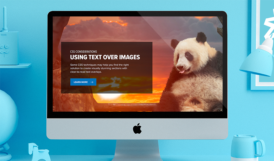
Example 2 – Using a Tinted Text Box
The second example is a traditional method for handling text overlays. Need to make your text more readable? Just add a background color behind the text. While this may not be as aesthetically pleasing as you would prefer, it remains effective in terms of ensuring users can actually read your overlayed text. For most cases, a simple transparent box (so that the background image is still visible) will work just fine.
This has the added effect of working across all devices, particularly if paired with Bootstrap. You can adjust the opacity of this text background to meet any desired needs.
Example 3 – Adding a Linear Gradient to the Image
Example 3 merges both of the previous examples. This method relies on the natural contrast of an image while providing a darkening tint through the use of liner-gradient properties. You may prefer this option has its less disruptive than separating the text in its own separate box while still ensuring areas of the background image can successfully accommodate readable text.
You can further adjust the linear-gradient so that it goes either horizontally or vertically, thus giving you fuller control over any modifications needed. This method also seems to work fairly well on mobile, although you do need to slightly consider the background image used.
Again, how you handle text on top of images comes down to the type of image you’re using, the level of contrast inherent in the image, and how its positioned on the page. However, with the above examples you should have a variety of adaption methods to fit your individual needs.

Scott Madara
Contributions Editor here at Solodev. Want to be featured on the Solodev Blog? Get in touch.
Follow me on Twitter


