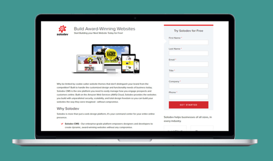
Craft an Engaging Landing Page
Attractive landing pages are like a restaurant's flavorful aroma as they bring visitors one giant step closer to engaging with your website. Here are a few tips to help your landing pages pack a bigger punch.

In my hometown, there’s a hamburger joint known statewide for the best burgers ever. The building itself barely packs more than 20 people, forcing hungry guests to line up and wait for 30+ minutes to get a leaking sack filled with deep-fried deliciousness. And yet hundreds continue to line up each day between 11 a.m. and 2 p.m. like clockwork.
By modern marketing standards, it’s an anomaly. They don’t spend money on advertisement. There’s no social media strategy. They don’t even bother encouraging word-of-mouth promotion.
So how does this tiny, nondescript hole-in-the-wall catch peoples’ attention? By smell.
A Laha burger has a distinct smell that’s just enough onion and just enough grease. The scent wafts for miles depending on the wind, and it only intensifies as you get closer to the door. Your favorite bakery or restaurant probably grabbed your attention in the same way, and you can use that as inspiration for your website's landing pages.
Landing pages are the smell to your website. They pique someone’s interest, and ultimately, they play a huge part in inbound marketing strategy for generating leads. And like a restaurant’s signature scent, the best landing pages can get people one step closer to tasting what you offer. So how can you tap into their power?
Landing Pages vs Homepages
Take note: a landing page is generally not the same as a homepage. One of the biggest mistakes new website users make is treating them as one-and-done pages.
Homepages should offer a wealth of information to site visitors. It’s filled with links that help branch off information and can even redirect someone to a landing page. Homepages are general purpose, and they set the tone and overall branding message of your company/website. They’re equally as important as landing pages but unique and should be treated as such. (and we detailed what makes a good homepage on this post here.)
At their cores, landing pages do one of two things: 1) gather personal information about a visitor in exchange for a promotion/product/service your site provides, or 2) prepares a visitor for your bigger sales pitch.
Make Sure Messages Match
The copy that your marketing team slaved over shouldn’t be relegated to the ads. Copy from pay-per-click advertisements -- particularly primary copy -- should be eerily similar (if not identical) to the copy you have on a campaign’s landing page. It sends a mental note to users that they are indeed where they need to be after clicking on an ad.
You can go deeper than aligning copy to matching the visual elements between ad and landing page. Do this by tapping into the same color schemes as the ad or the treatment of a unifying logo or design. It’s just one more way to reinforce the connections between an advertisement and your landing page.
Keep it Simple
As we mentioned above, landing pages have one of two purposes. Thus, they should have one clear focus. Multiple offers on a single landing page distract users and could frustrate them if they’re unable to continue easily from Point A to Point B. Distracting or irritating user experiences ultimately mean fewer conversions.
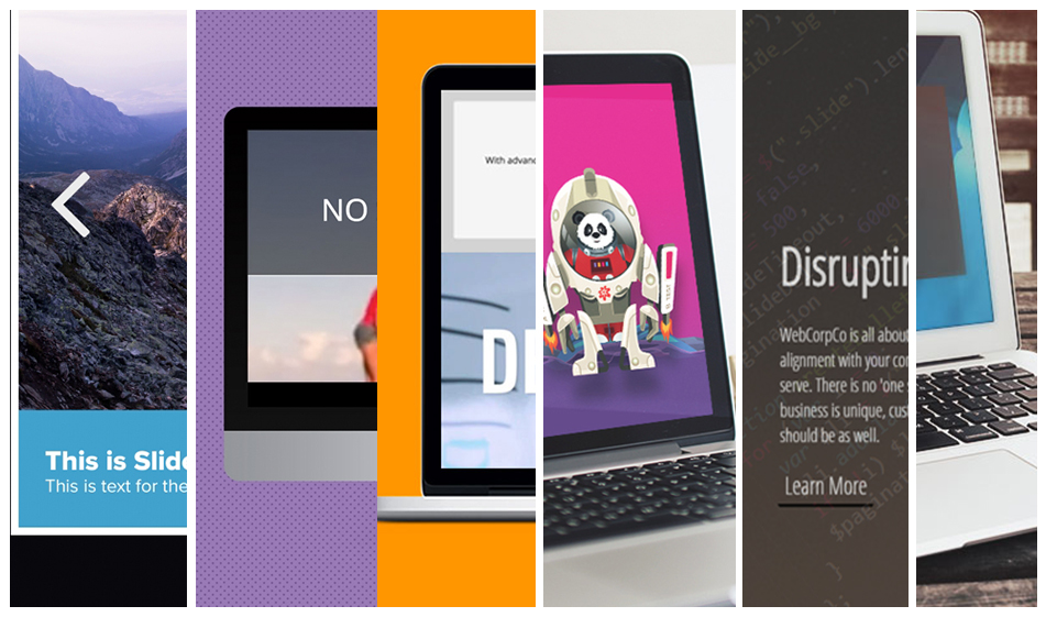
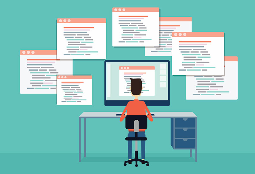
Think of a landing page’s design as a streamlined version of your homepage. To get a better understanding of what designs lead to higher conversions, be sure to A/B test the landing pages. Try pitting two button styles or two different graphic styles. It's also perfect for testing out copy, and make sure you deliver on the promise that initially drew them to the landing page. The beauty of flexible CMS is that it allows users to develop multiple pages and test multiple landing options. Think of CMS as the ultimate test kitchen, ready for you to whip up and test your creations in real time with a full analysis of what flavors worked and which ones didn't.
Layouts Matter
Over-the-top images, overwhelming colors, or gaudy font choices can quickly make a user regret clicking on your link. Certain restaurants have a smell that's just too strong; certain website designs can come across as too much. If a user clicked on an ad, there’s a good change that something about the ad piqued their interest – even in a seemingly miniscule way. Maintain that clean design and make sure the page isn’t too loaded with large images. A recent study noted that websites taking six seconds to load experience a 50 percent loss in conversion.
At the very least, make sure that the landing page includes an easily accessible way to get user information. Keep navigation tools as minimal as possible. After all, the whole point is to direct a visitor to a specific action.
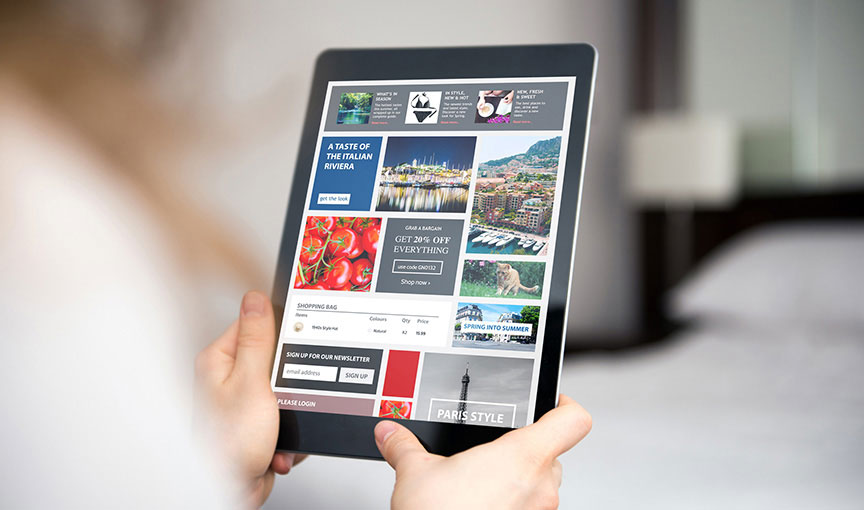
Optimize for Mobile
This tip should be second nature for most web designers. Now, more people turn to mobile devices rather than desktops for their Internet. Over 52 percent of online traffic comes from mobile use; that’s a 10 percent jump in less than a year.
Engagement is also significantly lower on mobile. If you don’t want your landing pages to get tossed to the side, check how they look on smartphones and tablets. Check image sizing and responsiveness, text and font sizing, and streamlined design.
The success of your landing pages comes from testing a variety of flavors for the most attractive aroma for website visitors. It's not a one-time fix for marketing. Landing pages require patience, effort, and a bit of creativity with a solid CMS platform.

Shelby Rogers
Contributions Editor here at Solodev. Want to be featured on the Solodev Blog? Get in touch.
Follow me on Twitter