 Cloud
Cloud
 CMS
CMS
 AI
AI
 Blockchain
 Digital
 IoT
IoT
 Metaverse
 Mobile
How to Make an Image Fill the Page Margins
When using Bootstrap containers, your image and text section will by default have padding on either side of it. Often, however, you will want your image to meet the page’s edge without padding.

When you have a featured image with text, it is better to remove all the padding and margin around it and have it fill the margins. Containers in Bootstrap come with automatic alignment, padding, and margins. In this tutorial, we'll show you how to add images without margins or padding.
First, we start out by creating a section tag to put our image and text in. Then we create a div to have a container to put our image in. We don't have to worry about re-scaling the image on different device breakpoints since Bootstrap has the .img-fluid class to make images responsive and scale at different screen sizes. This class applies max-width: 100% and height: auto to the image and makes the image scale with the parent element.
For our text, we will create a container element because we want our text to have the appropriate padding and margin. So, basically we create two separate children elements inside the section. Here's the full HTML of our layout:
HTML
Once we build our HTML structure, we need to add some CSS rule.
Below, used used the pseudo-classes of ::before and ::after and declared { content: ""; display: table; } to ensure that the containers and rows expand automatically with the size of their children elements. The image is set to { object-fit: cover; } so that it covers the entire area designated for the image and scales while retaining its proportions.
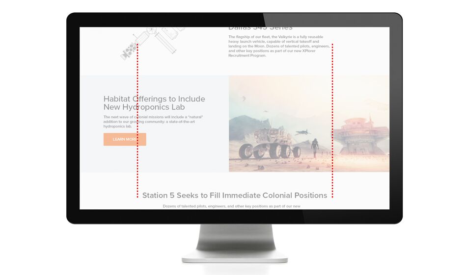
One important thing to emphasize is that it is recommended you use a horizontal/rectangular image for big screen sizes such as desktop screens as the large screens have a horizontal layout and the image needs to expand more horizontally than vertically. This ensures a good visual balance in the layout. This is why we provided two images: one for desktop screens and one for tablet and mobile screens. The image we used for the latter is square shaped to fit the layout better. You can either use the same image for all screen sizes, cropping the image for smaller screens or use two different images.
CSS
And here's the final result:
Paris Tuzun
Contributions Editor here at Solodev. Want to be featured on the Solodev Blog? Get in touch.
Follow me on Twitter


