Adding Responsive Navigation to your Website
With an increasingly mobile world, making sure your website's navigation is responsive is crucial to its success.
With an increasingly mobile world, making sure your website's navigation is responsive is crucial to the success of your website. Navigation is paramount to the ease-of-use your website provides and responsive navigation is essential to allowing website visitors to view and navigate your website on all devices with ease.
Below is the HTML and CSS required to add responsive navigation to your website.
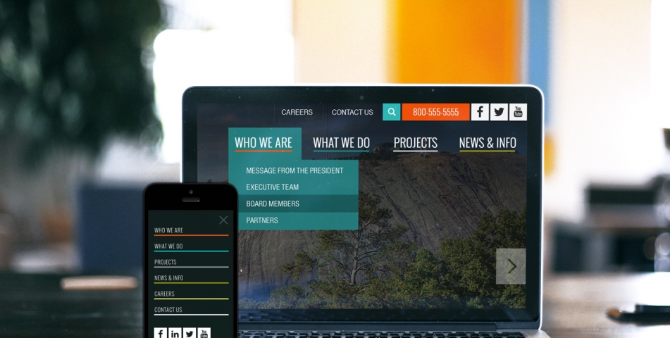
Step 1 - Add the HTML below to create your website navigation
<div class="parallax" id="parallax-cta" style="background-image:url(https://www.solodev.com/assets/pricing/company-hero.jpg);"></div>
<nav class="ct-nav">
<div class="navbar">
<div class="container-fluid">
<div class="navbar-header">
<a class="navbar-brand" href="/index.stml"><img alt="WebCorpCo" src="https://www.solodev.com/assets/side-nav/logo.png"></a>
</div>
<div class="navbar-content text-right">
<div class="inner clearfix">
<ul class="topbar">
<li class="topbar__socials">
<a href="" target="_blank"><i class="fa fa-youtube"></i></a>
</li>
<li class="topbar__socials">
<a href="//www.linkedin.com/in/WebCorpCo" target="_blank"><i class="fa fa-linkedin"></i></a>
</li>
<li class="topbar__socials">
<a href="//twitter.com/WebCorpCo" target="_blank"><i class="fa fa-twitter"></i></a>
</li>
<li class="topbar__socials">
<a href="//www.facebook.com/WebCorpCo" target="_blank"><i class="fa fa-facebook"></i></a>
</li>
<li class="topbar__phone">
<a href="tel:5555555555">555-555-5555</a>
</li>
<li class="topbar__item">
<a href="">Contact Us</a>
</li>
<li class="topbar__item">
<a href="">Careers</a>
</li>
</ul>
<ul class="nav navbar-nav navbar-right">
<li class="dropdown orange-drop motive" role="presentation">
<a aria-expanded="false" aria-haspopup="true" class="dropdown-toggle" href="" role="button"><span>Who we are</span></a>
<ul class="dropdown-menu">
<li>
<a href="">Executive Team</a>
</li>
<li>
<a href="">Staff</a>
</li>
<li>
<a href="">Board Members</a>
</li>
</ul>
</li>
<li class="dropdown accent" role="presentation">
<a aria-expanded="false" aria-haspopup="true" class="dropdown-toggle" href="" role="button"><span>What we do</span></a>
<ul class="dropdown-menu">
<li>
<a href="">Services</a>
</li>
<li>
<a href="">Start-Up Funding </a>
</li>
<li>
<a href="">Product Development</a>
</li>
<li>
<a href="">Blog</a>
</li>
</ul>
</li>
<li class="dropdown gray grey-drop" role="presentation">
<a aria-expanded="false" aria-haspopup="true" class="dropdown-toggle" href="" role="button"><span>WebCorpCo</span></a>
<ul class="dropdown-menu dropdown-menu--right">
<li>
<a href="">Explore WebCorpCo</a>
</li>
<li>
<a href="">Economic Impact</a>
</li>
</ul>
</li>
<li class="dropdown yellow gold-drop" role="presentation">
<a aria-expanded="false" aria-haspopup="true" class="dropdown-toggle" href="" role="button"><span>News & info</span></a>
<ul class="dropdown-menu dropdown-menu--right">
<li>
<a href="">Media</a>
</li>
<li>
<a href="">Public Relations</a>
</li>
<li>
<a href="">Conferences</a>
</li>
</ul>
</li>
</ul>
</div>
</div>
</div>
<div class="navbar-mobile navbar-fixed">
<a class="navbar-mobile__logo" href="/#"><img alt="WebCorpCo" src="https://www.solodev.com/assets/side-nav/logo.png"></a> <button id="sidenav-toggle" class="ct-menu-mobile__toggle navbar-toggle" type="button"><span class="sr-only">Menu</span> <span class="icon-bar"> </span> <span class="icon-bar"> </span> <span class="icon-bar"> </span></button>
</div>
</div>
</nav>
<div class="ct-sidenav">
<button class="close">x</button>
<img alt="Logo" class="ct-sidenav-logo" src="https://www.solodev.com/assets/side-nav/logo.png">
<ul class="list-unstyled ct-sidenav-list">
<li>
<a href="#">Who We Are</a>
</li>
<li>
<a href="#">What We Do</a>
</li>
<li>
<a href="#">WebCorpCo</a>
</li>
<li>
<a href="#">News & Info</a>
</li>
</ul>
<div class="inner">
<div class="separator"></div>
<ul class="list-inline list-unstyled">
<li><a href="">Careers</a></li>
<li><a href="">Contact Us</a></li>
<li><a href="">555-555-5555</a></li>
<ul>
<ul class="ct-socials list-inline list-unstyled">
<li class="topbar__socials">
<a href="" target="_blank"><i class="fa fa-youtube"></i></a>
</li>
<li class="topbar__socials">
<a href="//www.linkedin.com/in/WebCorpCo" target="_blank"><i class="fa fa-linkedin"></i></a>
</li>
<li class="topbar__socials">
<a href="//twitter.com/WebCorpCo" target="_blank"><i class="fa fa-twitter"></i></a>
</li>
<li class="topbar__socials">
<a href="//www.facebook.com/WebCorpCo" target="_blank"><i class="fa fa-facebook"></i></a>
</li>
</ul>
</div>
</div>
</div>
Step 2 - Add the CSS below to your website's main stylesheet to add style to your navigation
.parallax {
background-attachment: inherit !important;
background-repeat: repeat;
background-size: cover;
position: absolute;
top: 0;
bottom: 0;
width: 100%;
z-index: -10;
}
a,
a:hover,
a:focus,
a:active {
text-decoration: none;
color: inherit;
}
​
/*nav*/
.ct-nav {
position: relative;
z-index: 999;
}
.navbar-fixed {
position: fixed;
top: 0;
left: 0;
width: 100%;
}
.navbar {
position: absolute;
top: 0;
left: 0;
width: 100%;
color: white;
border: none;
}
.navbar > .container-fluid {
padding-left: 0;
padding-right: 0;
}
.topbar {
list-style: none;
}
.topbar:before, .topbar:after {
content: " ";
display: table;
}
.topbar:after {
clear: both;
}
.topbar li {
display: inline-block;
font-size: 20px;
text-transform: uppercase;
height: 47px;
line-height: 47px;
float: right;
transition: background-color 250ms cubic-bezier(0.55, 0, 0.1, 1);
}
.topbar li + li {
margin-right: 6px;
}
.topbar li a {
display: block;
}
.topbar li.topbar__socials {
background-color: white;
color: #111f1d;
width: 47px;
text-align: center;
font-size: 31px;
}
.topbar li.topbar__socials:hover {
background-color: #e6e6e6;
}
.topbar li .fa {
padding: 20% 0;
}
.topbar li.topbar__phone {
background: #00aceb;
padding: 2px 20px 0 25px;
font-size: 22px;
}
.topbar li.topbar__phone:hover {
background-color: #1180d3;
}
.topbar li.topbar__search {
width: 47px;
text-align: center;
background: #2fbfbc;
position: relative;
}
.topbar li.topbar__search a {
display: block;
position: relative;
background: #2fbfbc;
}
.topbar li.topbar__search.active .topbar__search-form {
width: 441px;
}
.topbar li.topbar__search:hover a {
background-color: #259694;
}
.topbar li.topbar__item {
padding: 2px 20px;
border-left: 1px solid rgba(255, 255, 255, 0.075);
letter-spacing: -1.55px;
}
.topbar li.topbar__item + li {
margin-right: 10px;
}
.topbar li.topbar__item:hover {
text-decoration: underline;
}
.navbar-brand {
padding: 20px 39px 10px;
}
.navbar-nav {
font-family: 'Oswald', sans-serif;
color: white;
font-size: 25px;
font-weight: 300;
text-transform: uppercase;
padding-top: 34px;
padding-right: 20px;
margin-right: -18px;
}
.navbar-nav > li {
position: relative;
line-height: 1;
margin: 0 15px;
padding: 0 2px 8px;
text-align: center;
letter-spacing: 1.1px;
transition: all 250ms cubic-bezier(0.55, 0, 0.1, 1);
}
.navbar-nav > li > a {
padding: 0;
line-height: inherit;
position: relative;
z-index: 1;
}
.navbar-nav > li > a:hover, .navbar-nav > li > a:focus, .navbar-nav > li > a:active {
background: transparent;
}
.navbar-nav > li:after {
content: '';
position: absolute;
bottom: -3px;
left: 0;
height: 4px;
width: 100%;
transition: all 250ms cubic-bezier(0.55, 0, 0.1, 1);
}
.navbar-nav > li.motive:after {
background: #00aceb;
}
.navbar-nav > li.accent:after {
background: #00aceb;
}
.navbar-nav > li.gray:after {
background: #00aceb;
}
.navbar-nav > li.yellow:after {
background: #00aceb;
}
.navbar-nav > li.lightyellow:after {
background: #00aceb;
}
.navbar-nav > li.white:after {
background: #00aceb;
}
.navbar-nav > li:hover {
transform: scale(1.15);
}
.navbar-nav > li:hover:after {
opacity: 0.7;
}
.navbar-nav > li:hover.accent:after {
background: #269694;
opacity: 1;
}
.navbar-nav > li.dropdown ul.dropdown-menu {
right: auto;
left: -10%;
top: 140%;
border: none;
border-radius: 0;
background: #237d7d;
padding: 10px 0;
box-shadow: none;
}
.navbar-nav > li.dropdown ul.dropdown-menu.dropdown-menu--right {
right: -10%;
left: auto;
}
.navbar-nav > li.dropdown ul.dropdown-menu li {
margin: 0;
}
.navbar-nav > li.dropdown ul.dropdown-menu a {
color: white;
text-transform: uppercase;
font-size: 20px;
font-weight: 300;
padding: 10px 28px;
background: transparent;
}
.navbar-nav > li.dropdown ul.dropdown-menu a:hover {
background-color: #175b5b;
}
.navbar-nav > li.dropdown > a {
display: block;
position: static;
}
.navbar-nav > li.dropdown > a:before {
content: '';
position: absolute;
top: -40%;
left: -10%;
width: 120%;
height: 180%;
background: #237d7d;
display: none;
}
.navbar-nav > li.dropdown > a span {
position: relative;
z-index: 5;
}
.navbar-nav > li.dropdown:hover {
transform: none;
transform: none;
transform: none;
}
.navbar-nav > li.dropdown:hover > a:before {
display: block;
}
.navbar-nav > li.dropdown:hover:after {
display: none;
}
.navbar .navbar-nav {
transform: translateZ(0);
}
.navbar-mobile {
height: 80px;
width: 100%;
background: #000;
box-shadow: 0 2px 5px 0 rgba(0, 0, 0, 0.16), 0 2px 10px 0 rgba(0, 0, 0, 0.12);
}
.navbar-mobile__logo img {
height: 80px;
}
.ct-menu-mobile__toggle {
border: none;
height: 80px;
width: 75px;
float: right;
font-size: 30px;
text-transform: uppercase;
margin: 0;
padding: 0;
background: transparent;
}
.ct-menu-mobile__toggle .icon-bar {
background: #fff;
height: 6px;
width: 50px;
transition: background-color 250ms cubic-bezier(0.55, 0, 0.1, 1);
}
.ct-menu-mobile__toggle .icon-bar + .icon-bar {
margin-top: 6px;
}
.navbar-scrolled .navbar .navbar-nav {
position: fixed;
top: 0;
right: 0;
margin: 0;
padding: 20px 0;
animation-name: navbar-animation-1;
animation-duration: 250ms;
}
.navbar-scrolled .navbar .navbar-nav li {
position: relative;
z-index: 10;
}
.navbar-scrolled .navbar .navbar-nav:before {
content: "";
background: #111f1d;
z-index: 10;
position: absolute;
top: 0;
right: 0;
width: 3333px;
height: 77px;
}
.ie8 .navbar-scrolled .navbar .navbar-nav:before {
height: 115px;
}
@-webkit-keyframes navbar-animation-1 {
0% {
top: -100%;
}
70% {
top: -5%;
}
100% {
top: 0%;
}
}
​
@keyframes navbar-animation-1 {
0% {
top: -100%;
}
70% {
top: -5%;
}
100% {
top: 0%;
}
}
​
/*SideNav*/
.ct-sidenav.open {
right: 0;
}
.ct-sidenav {
width: 343px;
width: 34.3rem;
height: 100%;
position: fixed;
z-index: 9990;
top: 0;
right: -34.3rem;
background: #191320;
padding: 75px 0 20px;
padding: 7.5rem 0 2rem;
overflow-x: hidden;
overflow-y: auto;
transition: right 0.25s ease-in-out;
color: #b7b6b6;
}
.ct-sidenav .close {
position: absolute;
top: 7px;
top: 0.7rem;
right: 15px;
right: 1.5rem;
text-shadow: none;
color: #fff;
transition: color 0.2s ease-in-out;
font-size: 80px;
font-size: 8rem;
opacity: 1;
filter: progid:DXImageTransform.Microsoft.Alpha(Opacity=100);
font-weight: lighter;
}
.ct-sidenav-logo {
max-width: 150px;
max-width: 15rem;
position: absolute;
top: 30px;
top: 3rem;
left: 60px;
left: 6rem;
}
.ct-sidenav-list {
padding: 50px 0 30px;
padding: 5rem 0 3rem;
color: #6e6e6e;
font-size: 22px;
font-size: 2.2rem;
}
.ct-sidenav-list > li {
transition: background-color 250ms ease-in-out;
}
.ct-sidenav-list > li > a, .ct-sidenav-list > li button {
font-family: 'Open Sans Condensed', sans-serif;
}
.ct-sidenav-list > li > a, .ct-sidenav-list > li button {
display: inline-block;
text-align: left;
width: 100%;
padding: 8px 25px 8px 65px;
padding: 0.8rem 2.5rem 0.8rem 6.5rem;
border: none;
background-color: transparent;
font-family: 'nimbus-sans-condensed', sans-serif;
font-weight: bold;
color: #fff;
font-size: 26px;
font-size: 2.6rem;
transition: all 250ms ease-in-out;
text-transform: uppercase;
}
.ct-sidenav .inner {
padding-left: 65px;
padding-left: 6.5rem;
}
.ct-sidenav .separator {
width: 100%;
height: 1px;
height: 0.1rem;
background-color: rgba(255,255,255,0.2);
max-width: 185px;
max-width: 18.5rem;
display: inline-block;
margin-top: 35px;
margin-top: 3.5rem;
}
.ct-sidenav .ct-footer-header {
padding-bottom: 15px;
padding-bottom: 1.5rem;
}
.ct-footer-header {
font-family: 'Open Sans Condensed', sans-serif;
}
.ct-footer-header {
color: #00bff3;
text-transform: uppercase;
font-size: 20px;
font-size: 2rem;
font-weight: 700;
padding: 30px 0 25px;
padding: 3rem 0 2.5rem;
}
.address {
font-size: 14px;
font-size: 1.4rem;
}
.address span {
display: block;
margin-top: 5px;
margin-top: 0.5rem;
}
.ct-sidenav .ct-footer-header {
padding-bottom: 15px;
padding-bottom: 1.5rem;
}
ul {
margin-bottom: 0;
font-size: 1.7rem;
}
.ct-u-paddingTop60 {
padding-top: 60px;
padding-top: 6rem;
}
.ct-search.form-group {
width: 100%;
display: block;
padding-right: 25px;
padding-right: 2.5rem;
}
@media only screen and (min-width: 1399px) {
.navbar-nav {
font-size: 31px;
padding-top: 41px;
}
.navbar-nav li {
margin: 0 25px;
}
.navbar-nav > li.accent {
margin-left: 27px;
}
.navbar-nav > li.gray {
margin-left: 35px;
}
.navbar-nav > li.yellow {
margin-left: 45px;
}
}
@media only screen and (min-width: 1024px) {
.navbar-mobile {
display: none !important;
}
}
@media only screen and (max-width: 1023px) {
.navbar > .container-fluid {
display: none !important;
}
.navbar-mobile {
display: block;
}
.ct-menu-mobile__toggle {
display: block !important;
}
}
@media only screen and (min-width: 768px) {
.dropdown:hover > ul.dropdown-menu {
display: block;
}
}
Step 3 - Add the JavaScript below to a file called nav.js
xxxxxxxxxx
$('.navbar-toggle').on('click', function() {
var $sidenav, $this;
$this = $(this);
$sidenav = $('.ct-sidenav');
if ($this.hasClass('active')) {
$this.removeClass('active');
return $sidenav.removeClass('active');
} else {
$this.addClass('active');
return $sidenav.addClass('active');
}
});
$('#sidenav-toggle').on('click', function() {
var $sidenav, $this;
$this = $(this);
$sidenav = $('.ct-sidenav');
if ($this.hasClass('open')) {
$this.removeClass('open');
return $sidenav.removeClass('open');
} else {
$this.addClass('open');
return $sidenav.addClass('open');
}
});
$('.ct-sidenav').find('button.close').on('click', function() {
$(this).parent().removeClass('open');
return $('#sidenav-toggle').removeClass('open');
});
Step 4 - Add the includes below to enable Bootstrap
xxxxxxxxxx
<script src="https://ajax.googleapis.com/ajax/libs/jquery/1.12.4/jquery.min.js"></script>
<link rel="stylesheet" href="https://maxcdn.bootstrapcdn.com/bootstrap/3.3.7/css/bootstrap.min.css">
<link rel="stylesheet" href="https://maxcdn.bootstrapcdn.com/font-awesome/4.6.3/css/font-awesome.min.css">
<script src="https://maxcdn.bootstrapcdn.com/bootstrap/3.3.7/js/bootstrap.min.js"></script>
<script src="nav.js"></script>