 Cloud
Cloud
 CMS
CMS
 AI
AI
 Blockchain
 Digital
 IoT
IoT
 Metaverse
 Mobile
Ultimate Guide to Understanding Bootstrap Tables
Tables don't have to be the most frustrating element of your web design. Bootstrap classes can help style your tables with a wide array of formats in no time at all.

Tables: once the bane of the web designer have reemerged in their proper role as the display of certain tabular data. As developers, you may encounter situations where a table is the best way to display certain data sets. In these situations, you may find yourself in a situation where your best opportunity to display your data is through a table.
Making tables as clean and clearly understandable as possible is our job as web design experts. But that doesn't mean we don't appreciate a handy shortcut. Fortunately for us, Bootstrap has a number of default classes which makes dealing with tables considerably easier. This includes the ability to make your tables responsive and mobile-friendly.
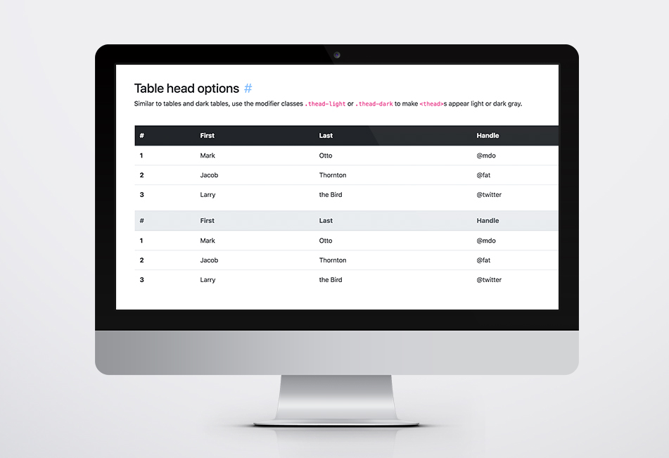
Utilizing default Bootstrap classes has additional benefits. You can, essentially, style your table within a wide array of formats. Include a border; have alternating row colors; style your table headings definitely; all are possible with bootstrap tables. Here's a bit more about how to use opt-in styling of tables using Bootstrap.
The Basics
Whether you’re using Bootstrap 3 or 4, you can create a set of standardized styles pertaining to your tables with just a few simple classes. Ultimately, you will want to give your table element the class of “table”, to create a basic example of a table component:
In the world of multiple devices, however, you will naturally want your tables to respond to width of any given device. You can do this by adding the class of “table-responsive” to a div that wraps the entire table element:
Tables: Redefined
While the above will get you a basic table display, you may ultimately want to stylize things differently. One of the best functional components to the Bootstrap table classes is the ability to “stripe” the rows, so that each row alternates in its background color. This makes the table much easier to read from a user perspective. Just add the class “table-stripped” to the overarching table element to implement:
To ensure that your users understand that tabular data is what they’re presented with, its always helpful to ensure that the container is totally enclosed within a border. Fortunately, there’s a Bootstrap class to ensure that your table contains a border around the entire element:
Tables with Additional Functionality
If you’re feeling adventurous, there’s a number of classes you can add to further help define your UX. Depending upon what a given row is supposed to do and convey, you can add a hover class to a given row. This is particularly useful if each row has its own onclick property:
You can even include default Bootstrap styles to include contextual styles so that you can showcase or otherwise highlight certain elements:
No matter your use, you will certainly encounter situations where a table is the best way to show specific data. If you’re like us and leverage Bootstrap to all it can be, you have a built in set of components to make sure your information stands apart. Browse Bootstrap’s default set of classes and leverage how they can work for you.

Scott Madara
Contributions Editor here at Solodev. Want to be featured on the Solodev Blog? Get in touch.
Follow me on Twitter


