
How to Use Text Animations with Slick Slider
Catch the attention of your audience and create smooth transitions between slides on your slider by adding these text animations.

If you use any sliders like hero sliders on your website, you know how important they can be to grabbing your audience's attention. Adding animations to your text will not only help draw more attention to your slider content, but it creates a smoother transition between slides as well.
In this tutorial, we'll show you how to create a sample hero slider using the Slick Slider by Ken Wheeler and add text animations. We'll use only CSS to create the text animations so no complicated Javascript code will be needed.
Getting Started
First, we include the necessary external sources to use Bootstrap and Slick Slider. Slick Slider comes with two files: A CSS file and a Javascript file. Copy and paste the links below on top of your HTML file:
HTML
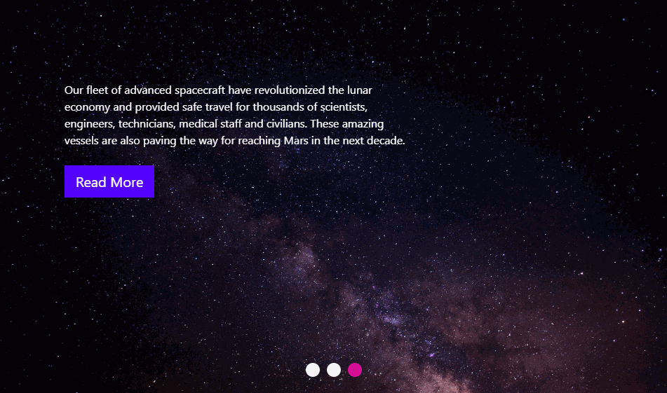
Once we add the external files, we build our hero slider then add the images and the text for each slide. Since we have a hero slider, we used the header tag to put our content in but if you wish to use a slider in any other part of your website, feel free to switch the header tag with other appropriate HTML tags. Take a look at the HTML code below:
Inside the header tag, we have a div with a class of hero. This will be the main slider container and inside this slider container, we have three slides with a classname of hero-slide. Each slide contains an image and a div with text content in it. After we finish building the slider structure and add the slide content, the next step is to make the slider function:
JQuery
As we mentioned above, we have a div container with a class of hero as our main slider container, therefore, we'll select this container in the JQuery below to attach our Slick Slider.
Note: In this tutorial, we put the Slick Slider JQuery code in the HTML file inside script tags but you can also put the code in an external .js file. Copy and paste the code below:
In the code above, we adjusted the settings for our slider. Here's some brief information about what the settings mean:
dots: You can set the dot's value to either true or false. When set to true, dots will be displayed below the carousel.
infinite: When set to true, the carousel items will loop infinitely.
speed: The speed of the scrolling carousel items in milliseconds.
fade: Instead of slides scrolling to the right, they will have a fade effect. The default for this setting is false. We set this option to !0 which means true. The reason is that text animations look better with a fading background rather than scrolling.
slidesToShow: is the number of slides or carousel items shown on desktop screens.
slidesToScroll: When set to 1, one slide will scroll at a time.
autoplay: When set to true, it will scroll automatically when the page is loaded.
responsive: Breakpoints for responsive display. In our example, we have the breakpoints of "1024", "600", and "480" measured in pixels. We can adjust the breakpoints by changing these pixel values as well as the number of slides or carousel items to show in each screen size.
You can see the full list of settings under Settings here.
Once our slider is working, it is time to create the animation effect for our text.
CSS
The CSS code below includes the styling rules to style the entire slider and the contents in it. Feel free to change the size and color of the elements as you like. We'll explain the part that pertains to the text animation.
In CSS, the @keyframes rule is used to create animations. It allows an element to gradually change by setting keyframes or waypoints along the animation sequence. Just like CSS gradients, it has a start and an end point such as 0% and 100%. The @keyframes rule is immediately followed by an identifier; this identifier binds the animation to that element. In our example, we named the identifier fadeInUpSD and set the animation-name property to fadeInUpSD as well:
Our text appears gradually after the slide is loaded and moves upwards so at the beginning point, which is 0%, we set the opacity to 0%. Then we set the transform property to translateY(100px); by doing that we move the text on the Y axis by 100px. At the end point, which is 100%, we set the opacity to 1 meaning the text is 100% opaque and we set the transform property to none so that there is no more animation.
Finally, we select the div that contains the text, which is the div with a classname of slide-content and specify the animation-name and animation-duration which is 1 second. Note that we specified the animation properties for each slide (.slide-content element) rather than selecting the slider container. This is because we want the text inside each slide to animate each time the slider changes slides. If you set the animation for the slider container, the text animation will only happen once after the page is loaded.
There we have it. Check out the JSFiddle below to see how the text animations work on the slider:

Paris Tuzun
Contributions Editor here at Solodev. Want to be featured on the Solodev Blog? Get in touch.
Follow me on Twitter


