
How to Feature News or Blog Posts Using Bootstrap's Grid System
Linking to recent news or blog posts on your website is a great way to drive customers to content. With Bootstrap's Grid System, you can feature your posts in attractive, easy-to-use components with images and text that help improve conversions.

Bootstrap is the bomb. It's still the most popular CSS framework on the planet, and we've always been big fans.
Sure, there are plenty of other frameworks – and new ones popping up all the time. But in an age of component-based web design, it's still the Godfather of Frontend.
What continues to make Bootstrap so handy is its powerful, mobile-first flexbox grid that lets you build all kinds of layouts. We all know the essential attributes like the twelve-column system, default responsive tiers, and predefined classes. But at the end of the day, Bootstrap makes stuff look sharp, and that’s why it’s still a go-to for designers.
We’ve written a number of posts about Bootstrap’s Grid system and how you can use it to make snazzy shopping cart layouts and storefronts that enhance customer experience. But what about the posts themselves? Can those be "Bootstrap Beautified," you ask?
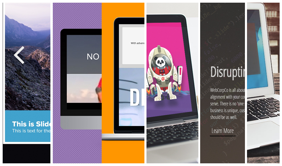
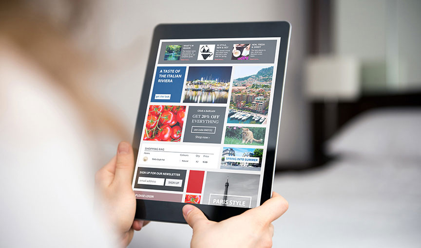
Yup! In this article, we’ll show you how to feature your recent news or blog posts with a Bootstrap-powered box layout. You’ve seen them before: clean images with snippets of your content, often displayed on a homepage (or other places). It’s a great way to showcase your most recent content and drive more traffic to supercharge your SEO.
A few rules of thumb to make your components neat and compact:
- Include a small image, like a resized feature pic from your post
- Keep the title and copy excerpt short and sweet
- Make the call-to-action clear and clickable
- Consider making the entire component linkable, not just the button
In the example below, we'll take you through the setup and styling for a three-box component section that should fit seamlessly into any page layout. We dig the subtle CSS shadows and hovers – but feel free to customize based on your own taste. Add more content, but again, less is more (which is why we opted for just the headline and link).
These boots were made for coding, and that's just what you'll do. Keep scrolling for the HTML, CSS, and everything else you'll need.
Step 1. Get the Bootstrap files
If it wasn't already obvious, this tutorial requires Bootstrap. No worries! You can simply copy-paste the CDN links below to use Bootstrap in your project. Then, copy-paste the stylesheet link tag into your head section before all other stylesheets to load the Bootstrap CSS.
Many of Boostrap components need JavaScript to function. Specifically, they require jQuery, Popper.js, and Bootstrap's own JavaScript plugins. Place the following script tags near the end of your pages, right before the closing body tag, to enable them. jQuery must come first, then Popper.js, and then our JavaScript plugins.
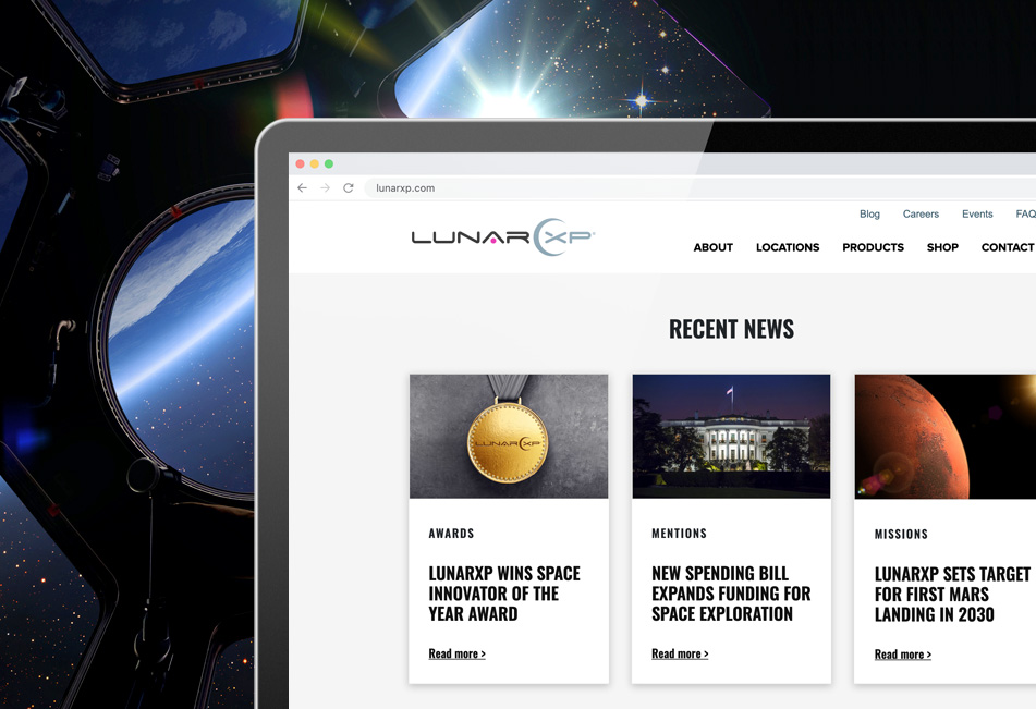
Step 2. Add the recent-posts.html
In the HTML code below, we have three boxes. Each box is inside a div container with a Bootstrap column. As the screen sizes get smaller, the boxes will collapse – and on mobile screens, each box will cover the full-width of the page. Bootstrap allows us to build the responsive part almost automatically.
We also added the display of each post's category name inside a span element. Displaying categories are often useful as they help identify what the blog post is about and gives the users the option to go to that category to see more posts belonging to that category.
Copy and paste the code below in your project's HTML file and swap out the links, the headings, and the img alt attribute.
Step 3. Add the style.css
The CSS below adjusts the spacing, font styling, and adds some colors. Feel free to change the fonts and the colors to match the section with your website's style:
And that's a wrap! Check out the JSFiddle demo below to see how the recent posts section looks like before committing to it:
Paris Tuzun
Contributions Editor here at Solodev. Want to be featured on the Solodev Blog? Get in touch.
Follow me on Twitter