
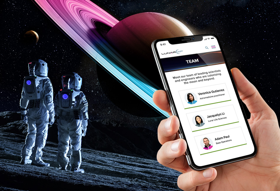
Create Bootstrap Mini Cards to Streamline Your Team Directories
Turn your team directories into clean, compelling, visually engaging experiences with simple Bootstrap cards that feature images and contact details.

Teamwork makes the dream work. And when you have an amazing, talented crew of professionals on your mission, they can be a huge part of promoting and selling your business. That's why most websites feature a "Team" or "About" section – so they can put the skills, experience, and general awesomeness of their people on display.
As your organization scales, you might require more "space" for your team, especially if you have business units or departments where a specific person needs to be featured. School and government websites are great examples, as they often have distributed departments with different people leading the charge. They also feature general staff directories for browsing the entire ship's complement.
When you consider the mobile experience, scrolling through long directories can be cumbersome. Sure, you could just slap down contact details in a list format. But bringing a little more visual structure can go a long way – and having an image (like a headshot) helps humanize the overall UX and improve engagement.
We've already shown you how to build a killer team page. Now, you can bring some life to your directories by using our slick "Mini Cards." These Boostrap beauties are simple, elegant, and easy to deploy – and they can improve the general organization and navigation of your directory pages. What's more is that these Mini Cards look amazing in mobile, stacking sweetly and enabling the user to focus more on the content.
In this tutorial, we'll show you how to compose these reusable components with a few essential properties. We'll include an image, name, and title – but feel free to construct your Mini Card with stuff that's relevant to your audience. That could be a phone number, email address, Star Base coordinates... whatever your mission calls for.
Follow the steps below and you'll be cleared for liftoff.
Getting Started
Since we're using Bootstrap to build our Mini Cards within a directory, copy and paste the links below in the head section of your project's HTML file:
HTML
The HTML code below utilizes the built-in Bootstrap classes for spacing and layout. There are three boxes inside a div container and each of them takes up a third of the width on large screens so we used the classname .col-lg-4 for each box container. The staff information is inside a div container with the classname of .box-information, containing div elements for image, text (for the person's name) and a job title inside a span element.
If you'd like to add more staff members, you can simply take a div container with the classname of .col-lg-4,copy paste it and change the person's image, name and title.
CSS
Custom CSS adds the necessary properties such as the flexbox layout, the box size, and the alignment of elements – as well as stylings such as element colors, borders, and font properties. The images are made round by applying a border-radius; it's your call, but we find that rounded edges are easier on the eye than elements with sharp edges. Circular profile images also accentuate faces, so we've rendered the container to feature the image with that format. Additionally, we applied the object-fit property and set its value to cover so that the profile images uploaded will be scaled to retain their original aspect ratios.
Feel free to change the colors and font styles to make the boxes match with your website's branding:
And there you go, intrepid explorer! If you'd like to see how it looks before you invest time in coding, check out the JSFiddle below: