
5 Ways to Optimize a Mobile Site
Mobile-first is an all-encompassing design and development philosophy that adequately addresses the needs of the modern user and how we all consume websites


We’ve all seen the statistics about how more people now than ever before are turning to their phones rather than traditional computers to access the internet. Last year, mobile usage of the internet surpassed desktop access for the first time in history. Those trends don’t stem from one specific country; global usage consists largely of mobile internet access.
Users expect websites to be responsive, easy to read, and engaging on all levels – but especially on their phones. Websites that aren’t optimized for mobile usage are akin to using a Polaroid to take a selfie or using a bag phone to call someone on the road. Sure, it technically still works but it gives less-than-stellar performance and indicates to literally everyone else that a website is stuck in a bygone era.
Mobile-first isn’t just an empty design trend. It’s an all-encompassing design and development philosophy that adequately addresses the needs of the modern user and how we all consume websites.
All of this is to say that you should treat mobile designs and interactions with the utmost importance. When designing a site, every style or development change should be viewed on desktop and mobile, in parallel. This brings our conception of mobile design up to level of significance it deserves based solely on site traffic.
The following are a few design, development, and marketing tips to optimize your mobile site. By following these concepts, you should make significant inroads with your mobile site’s usability and search engine optimization.
Start by Designing for Mobile
The first rule of thumb is essential: start by having mobile designs. When it comes to a website design or redesign project, designers often start with a general wireframe of the site’s layout. At this stage in the project, it is absolutely crucial to make sure there is a definite mobile-first design in place and that there is a strategic approach to how the site will render of mobile devices.
When making these designs, there are some fundamental concepts that should be implemented. First, don’t forget about ensuring there is adequate padding from the edges on mobile devices. Text with zero padding makes it incredibly difficult to read and looks inelegant. Similarly, make sure your elements are appropriately large enough on mobile devices. This includes your text and various actionable buttons. If your mobile users can’t legitimately read your content or press links/buttons, then you have an enormous user experience problem on your hands.
Lastly, it’s important to strip away as many unnecessary design elements as possible. This all comes down to that question of readability. Remove unnecessary graphics, use icons instead of bulky text, and make sure only the most pertinent pieces of information are displayed.
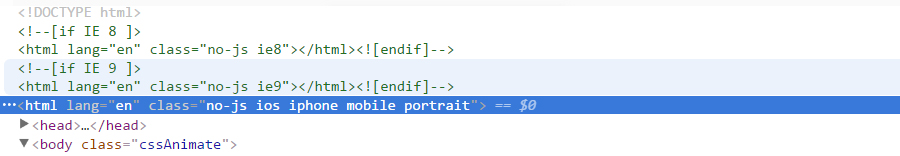
Add Device Specific Classes
Ideally, all styling changes would be simply handled by media queries and would globally affect all devices the same. Unfortunately, not all devices react the same nor do they have standardized dimensions or support the same libraries. While the vast majority of design elements will appear the same on different brands, there will be the odd outlier that will require its own device-specific solution.
One way to account for this is to apply a global class that includes the device or viewpoint. Using some JavaScript, you can detect the device in use and have your CSS handle those unique cases. Similarly, you can use an external toolset, such as Modernizr, which creates a number of classes depending on what device/browser in is use which allows you to specifically target screens that, say, don’t support Flash or HTML5 videos.
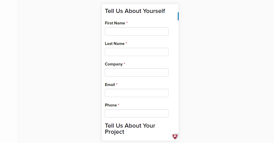
Don’t Forget about Forms
As web designers and developers, our primary goal is to create web experiences where users have the freedom and capability to interact. One of the clearest examples of this interaction is filling out a simple form, such as a contact or lead generation form. It is essential to make sure your forms are optimally styled for mobile devices so that your users can submit information when needed.
The simplest method to do this is to ensure that your form fields stack upon one another. Some common problems that arise, however, is that there’s no sufficient padding between the fields or that the field inputs themselves expand outside the viewpoint, requiring the user to scroll horizontally. You should be able to address these problems directly with media queries. Of course, a prebuilt mobile-first design framework such as Bootstrap should adequately handle these scenarios.
Don’t Use Popups on Mobile - EVER
You may be tempted to add popups at various points on your website. Sure, they have a time and a place. They can encourage user interaction, add to newsletter subscriptions, or drive the consumption of specific content. This is all fine on desktop views, where the user has enough screen space to close the popup and move on with their web experience. On mobile devices, however, it’s a completely different story.
Popups on mobile devices simply create bad user experiences. They often are impossible to manually close, they often extend outside of the viewpoint, and they generally make things more difficult for the end user. Users feel trapped to stare at a popup screen, and with no exit in sight, they could easily swipe out of your site entirely and opt for a less-intrusive competitor. Additionally, Google has specifically targeted mobile popups as a point of contention and will actively penalize your website. Simply put, don’t use mobile popups. Just don’t.
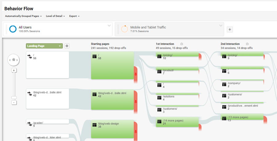
Analyze and Find Drop-off Points
Lastly, it’s important to analyze your mobile data and find drop-off points for your mobile visitors. This analysis should provide critical information as to where your users get hung up, frustrated, or otherwise decide to leave. Finding these pages can lead you to discover specific design elements that are not mobile friendly and which otherwise disrupt your experience.
Within Google Analytics, you can add a segment to your Behavior Flow to specifically see the overall progression of your mobile viewers. Diving into these specific mobile interactions is the first step to the continued optimization of your mobile websites.
It goes without saying that your mobile web experiences are a huge deal. With the trend of mobile traffic continuing, you don’t want to miss out on losing potential users due to either bad design elements or broken functionality. It’s absolutely crucial you to take the time to optimize and analyze the specific mobile view of your website. Following these basic tips, you should be well on your way to fully optimizing your mobile site.

Scott Madara
Contributions Editor here at Solodev. Want to be featured on the Solodev Blog? Get in touch.
Follow me on Twitter